Angular is a popular web application framework supported by Google and several other developers and corporations. While it is an excellent framework for building scalable, single-page applications, it doesn't provide a decent way to resize images for different placeholders correctly.
This is a fundamental requirement of any modern application and is also necessary for better page load time and SEO.
The only available options for resizing images in Angular is to either restrict the image size before upload or leave the resizing to client devices, both of which may not be ideal for web performance or your business requirements.
However, if you have been searching for better ways to resize images in an Angular app with minimal effort, your search stops now!
This article will leverage ImageKit.io to transform the images. We won't need any backend server, no manual work, and no bulk edits–just a single tool to get you the right image in real-time.
Let's Begin.
What is ImageKit?
ImageKit.io is a complete end-to-end image management product that simplifies image storage, optimization, and delivery for websites and apps. It comes with its own storage, but can also be integrated with any cloud storage like AWS S3, Google Cloud Storage, DO Spaces, etc., to deliver optimized, correctly resized images in real-time.
Unlike other solutions for resizing images on Angular, ImageKit does the image processing in real-time on its own processing servers present across the globe. Therefore, the client devices receive the image at the right size in milliseconds.
Neither the user's device nor the servers have to do any heavy image processing.
ImageKit provides an Angular SDK that simplifies its integration with Angular apps. We will be using this SDK in this article to demonstrate the different optimization and transformation features of ImageKit.
Getting started with the Angular ImageKit SDK
To use the ImageKit Angular SDK, let's scaffold an Angular project.
First, make sure you have the Angular CLI installed on your machine.
npm install -g @angular/cliThis installs the @angular/cli globally in your machine.
Now, we can scaffold an Angular project:
ng new ng-imagekitThe ng new command prompts you for the features to include in the initial app, and you can go with the defaults. After this step, you will see a folder with the name ng-imagekit, which contains our Angular app.
We can now start the application server.
cd ng-imagekit
ng serve --open
The ng serve the command launches the server, watches your files, and rebuilds the app as you make changes to those files. The --open (or just -o) option automatically opens your browser to http://localhost:4200/.
Next, we install the ImageKit Angular SDK:
npm install --save imagekitio-angularThe SDK contains two components:
- ik-image: This component lets you deliver optimized images in your app and transform them as per your requirement. We'll be using this in our blog and you can find its complete documentation here.
- ik-upload: This component lets you upload images to the storage integrated with ImageKit, called the Media Library. You can find more information about it in the SDK docs.
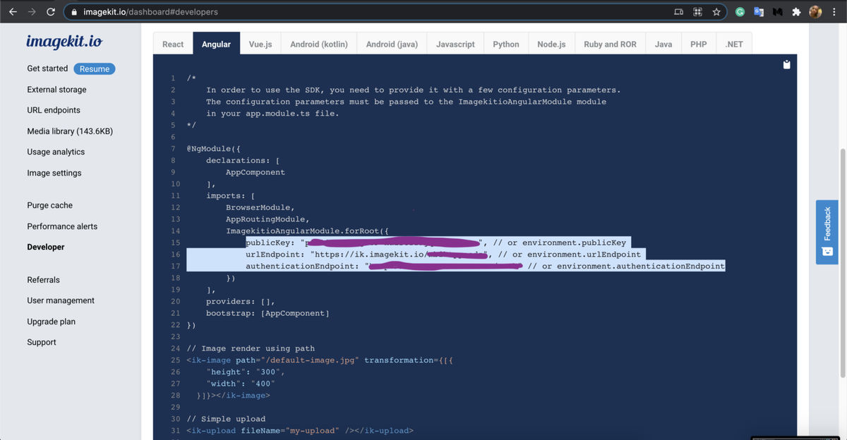
Let's import the module ImagekitioAngularModule in the root app module app.module.ts:
@NgModule({
  imports: [
    BrowserModule,
    FormsModule,
    ImagekitioAngularModule.forRoot({
      publicKey: YOUR_publicKey,
      urlEndpoint: YOUR_urlEndpoint,
      authenticationEndpoint: YOUR_authenticationEndpoint,
    }),
  ],
  declarations: [AppComponent, HelloComponent],
  bootstrap: [AppComponent],
})
export class AppModule {}
The publicKey and urlEndpoint are necessary parameters for initializing the SDK for image delivery.
To get them, of course, you need an ImageKit account. It comes with free 20GB bandwidth every month and an ample amount of storage.
After that, you can copy the key and the endpoint from the "Developer" section of the dashboard. Additionally, ImageKit makes it convenient to get started with any SDK.
So, you can go to the section for Angular and just copy-paste the startup code along with the parameters in your Angular app.
Now we are all set to use ImageKit in our Angular app.
Delivering images in Angular using ImageKit
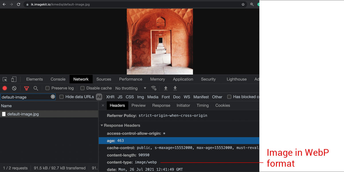
To render the image, we will use the ik-image tag. In the app.component.html file, add the ik-image component like this -
<ik-image src="https://ik.imagekit.io/ikmedia/default-image.jpg">
</ik-image>
You should pass the image URL to this component via the src attribute. You should now be able to see this image in the browser in your app.

By default, ImageKit converts the image to the best possible format and also compresses it. For example, if you load this in a Chrome browser, the image should get delivered in WebP format.
Resizing images in Angular - Basic height and width manipulation using ImageKit
ImageKit supports more than 40 image transformations. You can pass these transformations to the ik-image component via the transformations attribute.
The image above is 1000px x 1000px in dimensions. Let's resize it down to 100 x 100px .
Go to app.component.ts and create a property transform.
import { Component } from "@angular/core";
@Component({
  selector: "my-app",
  templateUrl: "./app.component.html",
  styleUrls: ["./app.component.css"],
})
export class AppComponent {
  transform = [{ height: "100", width: "100" }];
}
The transform property specifies the output image's height and width.
Transformations in ImageKit are passed as an array. This is done to ensure that we can chain multiple transform steps together in a specific sequence, this is often referred to as chained transformations.
But first, let's go to our app.component.html and bind this transform property to ik-image's transformations input property.
<ik-image
  src="https://ik.imagekit.io/ikmedia/default-image.jpg"
  transformation={transform}
>
</ik-image>
The resulting image URL is
https://ik.imagekit.io/ikmedia/default-image.jpg?tr=w-100,h-100The result is an image resized to 100px x 100px by ImageKit.

You can either specify an absolute value as we did above, i.e., 100or use a float number to specific in percentage, e.g., 0.5 means 50% original width. 0.1 means 10% of the original width, 0.4 means 40% of the original width, and so on.
Controlling the crop and aspect ratio of images
In the above example, the aspect ratio of the input image, 1000px x 1000px and the output image, 100px x 100px , was the same i.e., 1:1. Usually, this would not be the case. The input and output aspect ratios might be different.
For example, you might want to get a square thumbnail from a landscape image or get a portrait image from a square. ImageKit provides several transformations to control the output image's cropping and aspect ratio and tailor it to your layout's requirements. We can -
- Preserve the entire image while resizing it without cropping it. Let ImageKit control one of the two dimensions.
- Crop some parts of the image while matching the exact dimensions we specify.
- Add some padding around the image to match the exact size we specify.
Let's look at some examples of each of the above. In case you are curious, you should check ImageKit's documentation to know more about these cropping strategies.
1. Default Center Cropping
This strategy resizes the image to match the exact dimensions specified. Cropping will happen if the input and output aspect ratios don't match. This is the default cropping behavior
export class AppComponent {
  transform = [
    {
      height: 200,
      width: 300
    },
  ];
}
The URL would be
https://ik.imagekit.io/ikmedia/default-image.jpg?tr=w-300,h-200
2. Specifying only one dimension to preserve aspect ratio without cropping
ImageKit automatically adjusts the other dimension to maintain the image's aspect ratio without cropping the image.
export class AppComponent {
	transform = [{ height: "100" }]
}
The output URL is
https://ik.imagekit.io/ikmedia/default-image.jpg?tr=h-1003. Specifying both the dimensions to be used as a maximum bounding box, no crop, preserve aspect ratio
This strategy resizes the image to fit inside the dimensions specified. Only one of the two dimensions would be equal to those specified, whereas the other would be smaller than specified.
export class AppComponent {
  transform = [
    {
      height: 200,
      width: 300,
      crop: "at_max"
    },
  ];
}
The URL would be
https://ik.imagekit.io/ikmedia/default-image.jpg?tr=w-300,h-200,c-at_max
4. Specifying both the dimensions to be used as a minimum bounding box, no crop, preserve aspect ratio
This strategy resizes the image to at least fill a box with dimensions specified. Only one of the two dimensions would be equal to those specified, whereas the other would be larger than specified.
export class AppComponent {
  transform = [
    {
      height: 200,
      width: 300,
      crop: "at_least"
    },
  ];
}
The URL would be -
https://ik.imagekit.io/ikmedia/default-image.jpg?tr=w-300,h-200,c-at_least
5. Match the exact size without cropping, add padding around the image
This strategy resizes the image to match the exact dimensions specified, but instead of cropping out parts of the image, it adds padding around the image. This is accomplished by the parameter cropMode with its value equal to pad_resize.
The color of the padding added is white by default, but you can control it by specifying a hex code in the background parameter.
export class AppComponent {
  transform = [
    {
      height: 200,
      width: 300,
      cropMode: "pad_resize",
      background: "00FFFF"
    },
  ];
}
The URL would be
https://ik.imagekit.io/ikmedia/default-image.jpg?tr=w-300,h-200,cm-pad_resize,bg-00FFFF
Auto, Face and Object-aware smart cropping
The cropping methods covered above do not take into account the actual content of the image. For example, the thumbnail of an image where the subject is not at the center might end up cropping out the subject from the image completely.

ImageKit offers different methods to change where to focus in an image when creating a thumbnail. The most interesting of these options are the auto, face crop, and object-aware crop modes, which, as the names suggest, will automatically center the thumbnail on an important part of the image or the face or a specific object, respectively.
To use auto crop, you need to add the focus parameter to your transformation.
export class AppComponent {
  transform = [
    {
      height: 200,
      width: 200,
      focus: "auto"
    },
  ];
}
The URL will be
https://ik.imagekit.io/ikmedia/blue_balloon.jpg?tr=w-200,h-200,fo-autowhich would give you a better thumbnail like the one below

Similarly, to use the face crop mode, the value of the focus parameter has to be face.
We will use a different image to demonstrate the face crop mode.
Original Image:

The URL with face crop is
https://ik.imagekit.io/ikmedia/woman.jpg?tr=w-200,h-200,fo-faceand the output thumbnail will be like this:

You can compare this with the regular 200 x 200px thumbnail from the link here, and you would realize the benefit of face detection in thumbnail creation.
Object-aware cropping in ImageKit
As an extension of smart-cropping and face-cropping, object-aware cropping can be used when you want to single out a specific object from a multi-object image.
Use the parameter fo-<object name> in your URL to carry out the transformation and you can choose from a variety of 80+ objects ranging from food, drink, animals, everyday essentials and more.
For example, if you have an image of a living room, you can crop around the couch or the chair by specifying the focus parameter as couch or chair in the URL transformation, respectively.
Original Image of the living room

Object-aware cropping can be done in your code as shown below.
export class AppComponent {
  transform = [
    {
      focus: "couch"
    },
  ];
}
The URL in this case will be
https://ik.imagekit.io/ikmedia/Graphics/Furniture.jpg?tr=fo-couchThe different output images are shown below -
Cropped around the couch

Cropped around the chair

Other real-time image manipulations in Angular
While we have covered the basics of image resizing and cropping with ImageKit, it offers a lot more. You can combine other real-time transformation parameters in different ways to get the desired output image.
Let's look at some common use cases.
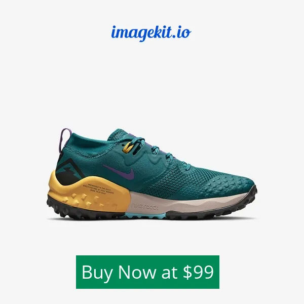
Overlay images and text for rich, dynamic images
An interesting use case of real-time image manipulations is to create rich, contextual images that you can use to level up the images you use in your app and help retarget your customers with dynamic assets in real-time.
For example, we have this image of a shoe:
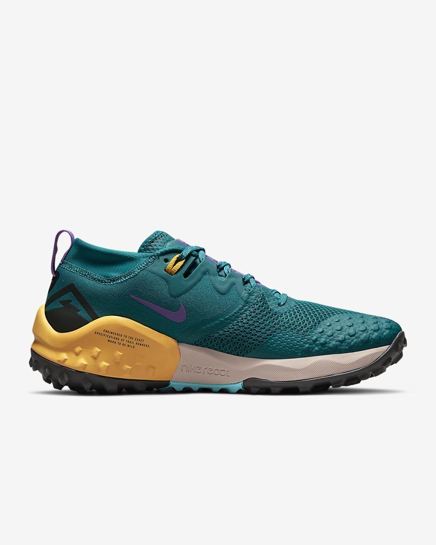
We have overlaid it with a logo and its price as text. We have also used the chained transformations feature of ImageKit to combine them in a definite sequence.
The URL looks a little complex, but the documentation for the overlay features does a great job explaining how each parameter works.
https://ik.imagekit.io/ikmedia/tr:w-600,h-600,bg-F5F5F5,cm-pad_resize:l-image,i-logo_HuFO6vJ2x.png,lx-220,ly-50,l-end:l-text,i-Buy%20Now%20at%20%2499,bg-008956,pa-10,co-FFFFFF,fs-36,lx-150,ly-N30,l-end/ik_ecom/shoe.jpegThe resulting image is richer and provides more context to the user looking at the image on your website or a third-party platform:
Using ImageKit for lazy loading images in Angular
While lazy loading images, it is common to have a placeholder image until the actual image loads.
From a UX perspective, using a blurred, low-quality variant of the original image provides a nice transition to the original image when it loads. Or you could use a placeholder with the same color as the most dominant color in the actual image.
You might have seen this happening in several publications, Medium being a popular one.
ImageKit makes it easy to create placeholders for lazy loading in real-time.
For example, we can create a low-quality image placeholder of an image using blur and quality transformation parameters.
https://ik.imagekit.io/ikmedia/blue_balloon.jpg?tr=w-400,h-400,bl-30,q-30| Original image | Low-quality placeholder |
|---|---|
 |  |
Adapting images for slow network connections
We often develop and test our websites on a fast internet connection, probably in our office. However, our real users are not always accessing our website through a stable connection or faster device.
Especially with more and more users accessing the web using mobile devices, the problem of flaky internet connection is far more common than we think.
To deliver images quickly to bandwidth-constrained users, we need to deliver even lighter images to such users. To do this, we need to compress the images more.
Yes, it results in lower-quality images, but they at least load on a user's device, which is better than no image loading at all.
ImageKit allows you to vary the compression applied to an image with the quality transformation parameter q. The value of q can range from 1 to 100, with 100 being the lowest compression, highest visual quality, and 1 being the opposite.
Modern browsers also allow detecting the user's network speed using the Network Information API. You can implement this API in a service worker, intercept requests for an image, and add the appropriate quality parameter to the image URL.
For example, on a slow 3G network connection, we can load the image with the quality value of 50.
https://ik.imagekit.io/ikmedia/blue_balloon.jpg?tr=w-400,h-400,q-50
This concept of varying the image compression level based on the user's network speed has been covered in detail in this blog about network-based image optimizations.
Conclusion
This blog looked at how we can use ImageKit's real-time image resizing and other transformation parameters in our Angular app to deliver the right image on every device. It provides a much better than the currently available methods of image resizing in Angular apps.
With the variety of transformations available in ImageKit, you would be able to deliver a perfect experience to your users.
ImageKit's free plan comes with real-time resizing and transformation features and free 20GB of delivery bandwidth every month. Sign up now for ImageKit and get started!


