Videos have become an essential part of web content, helping businesses showcase their products or services, promote their brand, and create engaging experiences for visitors. The catch? Online video is difficult to get right, and when implemented improperly (or unoptimized), can and will have a sizable negative impact on your website’s performance.
The crux of the problem is that low-quality videos load fast, but are a massive turn-off for audiences. Large, high-resolution videos are far more attractive but hog bandwidth and device resources, ultimately slowing down any user interface. Worse, this has a cumulative effect – it leads to perceived lag and sluggish UI, which leads to a bad first impression of your site, which leads to high bounce rates, i.e. users growing impatient, and leaving your website for greener pastures.
Fortunately, there is a reliable way to balance video quality and snappy UI – lazy loading. This involves loading videos only when they are needed, such as when a user clicks on a thumbnail, or scrolls to a section of the page where the video is located.
In this blog post, we’ll explore lazy loading in detail, look at the different ways to implement it, and some best practices for it.
What is lazy loading?
Any UI is built using components, or resources, that are either:
- blocking (critical, must be loaded as soon as possible; like CSS), or
- non-blocking (not critical; like images, videos, and iframes).
Lazy loading is a technique to defer the loading of those non-blocking, non-critical resources until they are actually needed by the user. This shortens the length of the critical rendering path, ultimately translating to faster websites.
Here’s the flow for how lazy loaded videos work:
- On initial page load, the video player component (or, with the right strategy, even a
<img>element with a video/play icon, that is later swapped in for the actual player in Step 2) is initially loaded without any video data. The webpage simply uses a placeholder image (usually, a server-generated default thumbnail) to represent the video content. - When the user scrolls to the area of the webpage where the video is located (Either natively detected by the browser, or using JavaScript’s Intersection Observer API) or clicks on the placeholder image/thumbnail, it triggers the actual loading of video data.
- The video data is then downloaded, loaded into the video player component, and playback begins. Depending on the implementation strategy and the browser being used, this data might now be cached on the user’s side.
- If the user scrolls away from the video or closes the video player before the end of the video, the video data is purged from the player to free up system resources (but the cache remains), ensuring snappy, responsive UI/UX no matter what.
- If the user decides to watch the video again, the player can retrieve the cached video data from the browser without needing to download it from the server again, only redownloading parts that weren’t cached.
What are the advantages of lazy loading videos?
By deferring the loading of video data until it is actually needed, lazy loading reduces the initial load time of the webpage, and also the amount of effective data that needs to be downloaded. Let’s summarize the advantages of this approach:
- Faster page load times: By only loading video content when it's needed, lazy loading significantly reduces the time to First Contentful Paint (FCP) ensuring not only a better user experience, but also improved search engine optimization as this is the first metric Google emphasizes for higher rankings (as seen in Google PageSpeed Insights).
- Reduced bandwidth usage: Lazy loading can help reduce the amount of bandwidth used by a website – especially beneficial for users on mobile devices, or in areas with slow or limited internet connectivity.
- Improved server performance: By only serving video content when it's needed, lazy loading reduces server-side load by reducing the total number of network requests. This translates to improved performance and reduced costs. Lazy loading strategies that use caching also help – when a user accesses a video that has already been loaded, the browser can just retrieve the cached data from the user's device, instead of downloading it again from the server.
- Enhanced user engagement: The role of lazy loading is pretty obvious here – users are more likely to stay engaged with a website the quicker it loads, and the more responsive and snappy the UI/UX feels. Lazy loading can also serve as a psychological optimization strategy, ensuring that an explosion of video content, all ready to play at once, doesn't distract users from the main content – not until they're ready to view them.
How to implement lazy loading videos
Now that we know the What and the Why of lazy loading videos, let’s look at the How. There are three ways of doing this.
1. Natively – the HTML5 element
With the latest HTML specifications, implementing lazy loading for videos (that shouldn’t autoplay) can be as simple as using the HTML5 <video> element with the preload attribute set to none like so:
<video controls preload="none" width="300" poster="my-thumbnail.jpg">
    <source src="my-video.mp4" type="video/mp4">
</video>
It’s that simple. You don’t even need to be an experienced web developer to make this change.
The preload attribute set to none tells the browser to not load video data upon page load, and that playing the video is entirely up to the user (the controls attribute enables the latter). We’ve also talked about how lazy loading videos involves a thumbnail being loaded instead of the actual video, and the poster attribute is what makes that possible (defaults to a black/grey block if such a thumbnail image is not set).
Using native lazy loading this way is a fairly safe strategy, supported by over 95% of all users worldwide, as of April 2023. Plus, Native lazy loading doesn't require any extra JavaScript (so no dependency to manage, no bugs or compatibility issues to sort out), the content will still load if a script fails to load or is blocked, and the browser is going to make better, faster decisions about which videos to load and when than any JS plug-in ever could.
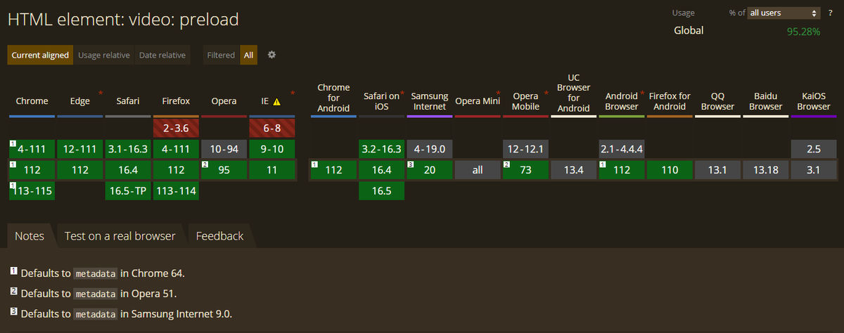
Note that setting preload to none would mean that not even video metadata (such as title, duration, etc.) is loaded. If you don’t explicitly do this, preload will default to at least loading metadata in some browsers (Chrome v64, Opera v51, etc., barring user device settings like Data Saver Mode, which forces it to none.)
But there are a couple of gotchas with this approach.
- What if you wanted to lazy load the thumbnail image (
poster) too? - On the flip side, if the video in question is an important part of your page’s content, you want its
posterattribute loaded as soon as possible but have the video itself be lazy loaded. Doing either isn’t easy with a native browser-based solution. - If you wanted to add animations like fade-ins, for example, you couldn’t. Not with just the native API.
So how can we iron out these issues? Let’s look at the next two methods.
2. With JavaScript – Intersection Observer
The Intersection Observer API is used to detect the visibility of an element, or the relative visibility of two elements in relation to each other, and take action. This gives us the ability to implement the following strategy :
- Mark the videos to be lazy-loaded via a CSS class, and instead of having its link in the
srcattribute put it indata-src(an HTML5 data attribute) instead. - Using the Intersection Observer API, detect when any video tag with that selector scrolls into view…
- …and replace its
srcattribute with thedata-srcattribute, programmatically.
By making the tradeoff of having more JavaScript, we gain the ability to be more fine-grained with our implementation of lazy loading. This approach is entirely in JavaScript, meaning our two drawbacks with the native approach are now gone:
- For the thumbnail, we can use a static image overlaid over the video we want lazy loaded, and positioned with CSS. The advantage? Our thumbnail image can now be prefetched with high priority (using
fetchpriority="high"). Something we couldn’t define with granularity for the first approach! - Animations like blur or fade in/out are easily implemented using Intersection Observer and CSS transitions, the Animation API, or whatever animation library you want.
Here’s a very simple step-by-step implementation.
- Don’t even have an
<video>in your DOM. Have a placeholder<img>in its place instead, which has a high fetch priority explicitly set. With our implementation, this element will get removed and swapped in for the actual<video>when the user has seen more than 50% of the placeholder image.
<div id="lazy_container">
        <img
          id="placeholder_image"
          src="your_placeholder_image.jpg"
          fetchpriority="high"
        />
      </div>
2. Using JavaScript (the Intersection Observer API), trigger the loading of the video when the user scrolls down to it, by removing the <img> entirely and replacing it with your actual video, with its poster attribute set to the same placeholder image URL.
var img = document.getElementById("placeholder_image");
var lazyContainer = document.getElementById("lazy_container");

const options = {
  root: null,
  rootMargin: "0px",
  threshold: 0.5 // Trigger when img is 50% visible
};

var observer = new IntersectionObserver(function (entries) {
  entries.forEach(function (entry) {
    if (entry.isIntersecting) {
      // remove the img
      lazyContainer.removeChild(img);
      // create a video instead
      const videoElement = document.createElement("video");
      videoElement.src =
        "your_video.mp4";
      videoElement.alt = "Lazy-loaded Video";
      videoElement.poster =
        "your_placeholder_image.jpg";
      videoElement.controls = true;
      videoElement.preload = "none";
      // swap it in for the img
      lazyContainer.appendChild(videoElement);
      // load video
      videoElement.load();
      // disconnect observer
      observer.unobserve(img);
    }
  });
}, options);

observer.observe(img);
This is a simple enough implementation, but it works rather well. See for yourself!
But if you’d rather not write JavaScript boilerplate at all, the next step is for you.
3. With Third-party solutions – Lazy Loading libraries.
1. vanilla-lazyload
LazyLoad is a free and open-source, lightweight (2.4 KB gzipped and minified), flexible script that speeds up your website by deferring the loading of your below-the-fold images, backgrounds, videos, iframes, and scripts to when they will enter the viewport, with an optional buffer added. Written in plain "vanilla" JavaScript, it leverages Intersection Observer, supports responsive images, and enables native lazy loading.
2. Lozad.js
Another free and open-source, highly performant, lightweight (~1 KB gzipped and minified), and configurable lazy loader, written only in pure JS with no additional dependencies. It enables lazy loading for images, iframes, videos, audio, and more, using IntersectionObserver API only. It even supports hassle-free LQIP (Low-quality image placeholders) implementation.
3. yall.js (Yet Another Lazy Loader)
This is an SEO-friendly lazy loader that uses Intersection Observer where available, falling back to event handlers otherwise. yall.js can also monitor the DOM for changes using Mutation Observer to lazy load elements that have been appended dynamically to the DOM after the initial load, which makes it ideal for SPA use cases. Its major selling point is that it can streamline lazy loading autoplaying <video>’s as animated GIFs, lazy load the <video> element poster (thumbnail) images, as well as CSS background images.
4. For React, Vue, Angular, etc.
If using a framework, you have a few options.
- Use a framework-specific lazy loading library (like vue-lazyload-video)
- Use the same Intersection Observer based approach mentioned before, with a framework-specific library (like react-intersection-observer)
- Use conditional rendering, combined with some sort of fallback UI for loading. Most UI/component libraries for these frameworks (MUI, etc.) provide "skeletons" (or some equivalent) as components. These can add a visual indicator of loading state – aka, ‘gleam’ – that lets the user know this is content that is in the process of loading. It boils down to "if data is loading, render loading state (i.e. skeletons or some other loading animation, like a spinner or progress bar). Else, render content.” With this approach, you can easily use your
<video>elements for lazy loading, without needing complex, expensive JavaScript, or any additional library. - For meta-frameworks (like Next.js) use their optimized implementations for rendering images and videos. These come with best practices built in (thumbnails, lazy loading, LQIP, etc.) with no external dependencies, and only minimal configuration on your part.
How To Test Your Lazy Loading Implementation
To test the lazy loading implementation on your website and optimize it for performance, the simplest way is to use your browser’s dev tools.
Here’s a quick example app that uses a <video> element, with autoplay turned off, lazy loaded with preload set to none, and a poster attribute as a thumbnail.
<video controls preload="none"
poster="https://images.unsplash.com/photo-1488928741225-2aaf732c96cc?ixlib=rb-4.0.3&ixid=MnwxMjA3fDB8MHxwaG90by1wYWdlfHx8fGVufDB8fHx8&auto=format&fit=crop&w=1470&q=80" width="480">
        <source

          src="https://interactive-examples.mdn.mozilla.net/media/cc0-videos/flower.webm"
          type="video/webm"
        >
        <source
          src="https://interactive-examples.mdn.mozilla.net/media/cc0-videos/flower.mp4"
          type="video/mp4"
        >
      </video>
Now, using Chrome as our example, hit F12 to bring up Chrome Dev Tools, navigate to the Network tab, and then Media to check the loaded media assets.
When this page is loaded for the first time (or if you hit refresh right now), only the media assets that we have specified as needing to be preloaded (or, have marked with a fetchpriority="high") are loaded – which are none in our case, since we marked our <video> element with preload="none" explicitly.
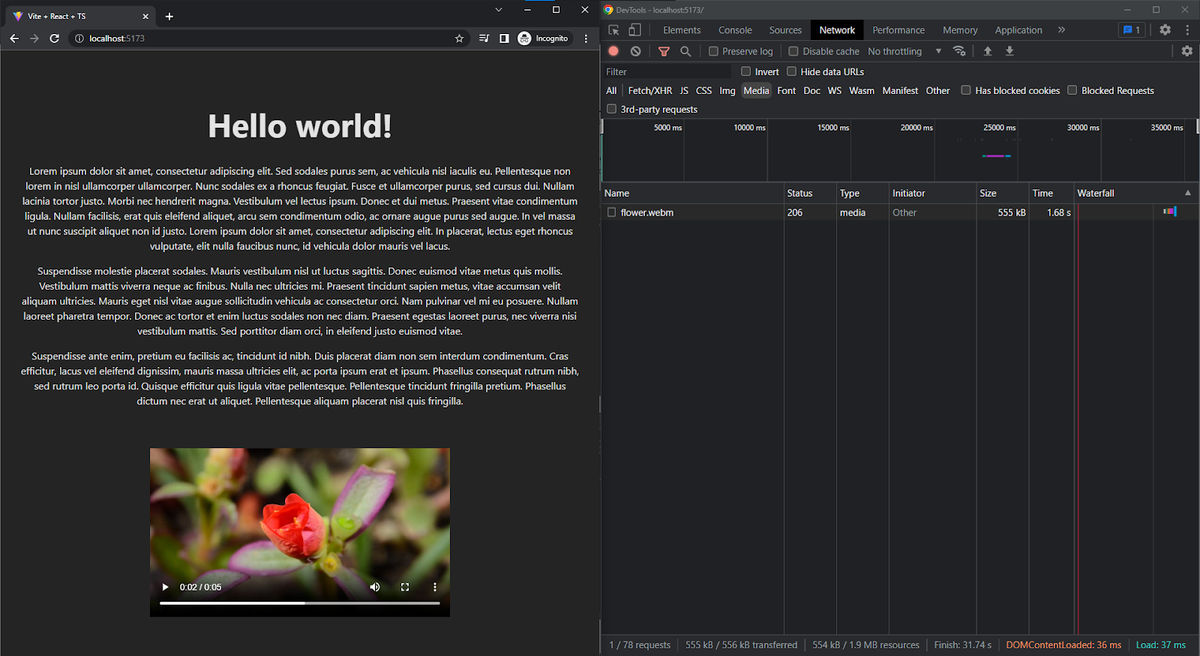
The network tab shows the deferred loading of the video. The video element itself is in the viewport, but since we have specifically set preload to none with autoplay turned off, it’s still using the placeholder image, with no video data loaded.
Also, note that the waterfall column shows the time taken for each Media asset to be loaded on this page. These timings can help you identify performance issues for assets on this page, if any.
Now, if we click Play on the video controls…
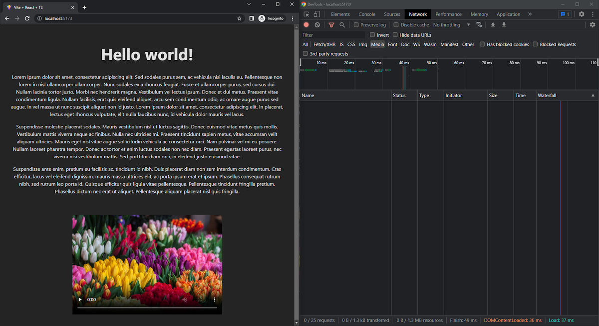
…the thumbnail goes away, the video file – flower.webm – is actually loaded as seen in the Network requests tab on the right, and playback proceeds as usual. Looks like our minimal lazy loading implementation works well!
This approach to testing your lazy loading implementation (i.e. using Dev Tools to monitor resource loading in the waterfall) is going to be the same even if you were using any of the more advanced approaches mentioned above.
If you’re after more advanced analytics, use a website performance testing tool, such as Google PageSpeed Insights, or Chrome’s Lighthouse audit to analyze your website's performance and identify any issues, or opportunities for improvement.
Best practices for lazy loading HTML videos
It is important to implement lazy loading videos correctly to avoid negatively impacting user experience. In this section, we'll discuss the best practices to follow while implementing and lazy loading videos.
1. Don’t lazy load everything
It can be tempting to add lazy loading to every video on your website, but this will actually end up hurting your user experience – not to mention Google Pagespeed metrics.
You need to consider how each video is positioned on each page. Are you using an autoplaying video as the Hero element on a page? Then it should never be lazy loaded, as that is an important part of the composition and design of that specific page, and viewers need to see it as soon as possible. On the other hand, an explainer video that comes alongside (or just under) the product description and details on an eCommerce website’s product detail page can and should be lazy loaded.
A pretty good rule-of-thumb to follow for determining which videos (or indeed, any element at all) should be lazy loaded is to consider where they are located on the page, in relation to the “fold” – a term for the bottom of the screen as it stands on initial load, before any scrolling takes place. Picture a newspaper. Anything “above the fold” is front and center, the most eye-catching story, and should be part of your LCP strategy, i.e. not lazy loaded. Anything “below the fold” can safely be lazy loaded.
2. Choose the right video format to ensure compatibility
While using the <video> element, it’s quite common to include a number of fallback videos, in different formats (and ending with an error message for the worst-case scenario), in case the first option isn’t compatible with the viewer’s device/browser. Like this, for example:
<video controls>
  <source src="example.mp4" type="video/mp4">
  <source src="example.webm" type="video/webm">
  <source src="example.ogg" type="video/ogg">
  Your browser does not support the video tag.
</video>
You want to ensure that your videos are optimized for web use, encoded in a format that balances compatibility and quality, and are in a format that is widely supported. The most popular video format for the web is MP4 (usually coded using H.264) which is supported by most browsers and devices. The other popular format is WebM (Using the VP9 codec), which is an open-source alternative that also has almost-universal support. There are other format/codec combinations which may provide smaller file sizes, but do not enjoy as broad a compatibility.
Listing such fallback variants can be exhausting. You’d have to generate different versions of the same video, host and link them yourself, and that’s not even getting into how they make frontend code harder to write, read, and maintain.
However, with an end-to-end Digital Asset Management and delivery platform like ImageKit, for example, this is handled for you automatically, you always serve the best-fit format to the end user – with zero infrastructure or additional dependencies on your part. Here’s what you have to do:
- Upload a single source video on ImageKit’s Media Library,
- Enable "Use best format for video delivery" from your ImageKit Dashboard,
- Copy out the ImageKit resource URL.
That’s it, it’s that simple. ImageKit’s automatic Format Optimization will now deliver a single, unchanging URL that you need to embed – with the actual file format variant generated and served automatically, changing according to the device and browser support available.
The video actually delivered to the browser could be MP4 (H.264 encoded), or WEBM (VP9 encoded) depending on the viewer’s device/browser, with no variants needing to be explicitly coded by you within the <video> element, and with the end-user being completely unaware of this substitution. All they experience is the end result – a smaller video file, optimized for their device, and much faster playback times.
3. Use native methods for lazy loading whenever possible
Serving audiovisual content over the internet is not foolproof. No matter how much you optimize, the occasional server or client error is inevitable and your video may not load at all, even if lazy loading was implemented well. You’ll need to handle these edge cases to ensure a good user experience…leading to even more code.
For this reason, while lazy loading videos, it’s recommended to go with a Native solution wherever possible over JavaScript. Here’s why:
- It’s lean and fast, with no external dependencies, and very minimal coding required. You don’t have to be an experienced developer to add the HTML5 attributes required for it.
- With a native browser-based solution, even if all your lazy loading strategies fail, the content will still load, automatically, without any explicit fallback logic required on your part.
4. Use thumbnails until the video is played
Using some sort of placeholder/thumbnail (most commonly the poster attribute in HTML5 <video> elements) is highly recommended when lazy loading videos. This provides a much better user experience, as without it, the video will just appear as an ugly black/white block.
If using ImageKit, you won’t have to host thumbnail images yourself – just generate them from frames of the video itself using Video Transformations:
If you want the thumbnail to be the first frame of your video, just append /ik-thumbnail.jpg to your resource URL.
<video controls preload="none" width="480" poster="https://ik.imagekit.io/your-imagekit-id/your-video.mp4/ik-thumbnail.jpg">
    <source src="https://ik.imagekit.io/your-imagekit-id/your-video.mp4" type="video/mp4">
</video>
If you want a specific frame to be used as the thumbnail instead, specify the start offset time in seconds as an so transform. The example below will use the frame at 5 seconds from the start of the video, as its thumbnail.
<video controls preload="none" width="480" poster="https://ik.imagekit.io/your-imagekit-id/your-video.mp4/ik-thumbnail.jpg?tr=so-5">
    <source src="https://ik.imagekit.io/your-imagekit-id/your-video.mp4" type="video/mp4">
</video>
5. Use placeholders to avoid Cumulative Layout Shift
Generating thumbnails as a placeholder is important for more than just avoiding ugly <video> elements, as not using them while lazy loading can also cause Cumulative Layout Shift (CLS) – disorienting layout changes where the rest of the content jumps around the page as the <video> pops into existence out of nowhere, as the user scrolls to it. These layout changes are more than just bad UI/UX for the user, as they’re expensive DOM layout operations, and eat through device resources when they are triggered.
Pointing the poster attribute to some sort of placeholder image is essential (making ImageKit a great solution for your entire content pipeline – from images to video). Also, don’t forget to include width and height attributes for each <video> element you use, to make sure the user sees something, anything at all on the page that hints at the existence of an element that hasn’t loaded in yet.
If using React/Next.js, use conditional rendering or Suspense Boundaries with a fallback UI to avoid this.
6. Using an appropriate video player for lazy loading
Using an HTML5 video player for your site/app is a common practice – they enable accessibility, monetization, ads, adaptive streaming, and more.
Most modern HTML5 video players are well-suited for lazy loading, including Video.js, Plyr, and MediaElement.js. These players are free and open-source, customizable, lightweight (requiring no external dependencies like jQuery), support lazy loading out of the box with no additional work on your part, and have full support for fine-grained preloading, even for the poster image itself.
Conclusion
Summing things up, lazy loading can greatly improve website performance by reducing the number of assets that need to be loaded when the page is initially loaded, saving bandwidth, and reducing loading times. This in turn lifts up the user experience and boosts engagement while also helping to reduce bandwidth usage and improve SEO.
If you are a website owner or developer, consider lazy loading videos on your website using open-source libraries and HTML5 players, for an optimized, consistent UI/UX. Customize it to fit your needs, and follow best practices to avoid UI/UX issues like Cumulative Layout Shift and low Google Pagespeed/Lighthouse scores caused by haphazard implementation.
Work smart, not hard.
In that endeavor, ImageKit will serve you well. ImageKit is an excellent choice if you want to streamline your video operations. It offers elaborate video optimization and transformation capabilities that can help you deliver the most compatible video format to your users every time, generate thumbnails from your video on the fly, and not have to deal with the hassle of generating and hosting multiple variants of every video you use for your website to ensure compatibility…and you get to do all of this without any additional programming expertise or server infrastructure on your part.
Sign up for ImageKit to get the hang of what it can do for your business.


