Vanilla Next.js images handles the basics of image optimization well: lazy loading, responsive srcset generation, WebP conversion, and compression. But it offers limited options for more advanced requirements, such as automatic AVIF format conversion, limited support for optimizing animated images, and other advanced media transformations and GenAI, that can help us deliver exceptional image experiences on the web.
There's also a practical consideration: when deployed on Vercel, image optimization is billed by usage. As your traffic grows, the cost of on-the-fly transformations and bandwidth can increase significantly.
That's where ImageKit comes in.
In this guide, we'll jump straight into using the ImageKit Image component, which is built on top of next/image, to enhance image optimization in a Next.js app. We'll cover both the basics and advanced optimizations and transformations to help you create faster, smarter, and more visually polished experiences.
What we'll cover:
- Setting up the ImageKit SDK.
- Automatic WebP and AVIF delivery and compression.
- Responsive images.
- Lazy loading with a blur-up placeholder.
- Smart cropping images with fo-face and fo-auto.
- AI transformations: background removal and extending an image with generative fill.
The complete working code is in the nextjs-image-optimization repository.
Setting up the ImageKit SDK
The ImageKit Next.js SDK requires Next.js version 13 or above. It works with both the App Router and Pages Router, and can be used in both server components and client components.
Install the package:
npm install @imagekit/nextThe SDK is lightweight and has first-class TypeScript support with type definitions for all components and transformations.
Wrap your root layout with ImageKitProvider to set default values for urlEndpoint across all nested Image components:
// app/layout.tsx
import { ImageKitProvider } from '@imagekit/next';

export default function RootLayout({ children }: { children: React.ReactNode }) {
  return (
    <html>
      <body>
        <ImageKitProvider urlEndpoint={process.env.NEXT_PUBLIC_IMAGEKIT_URL_ENDPOINT!}>
          {children}
        </ImageKitProvider>
      </body>
    </html>
  );
}
Alternatively, you can wrap individual pages or skip the provider entirely and pass urlEndpoint directly to each Image component.
Add your URL endpoint to .env.local:
NEXT_PUBLIC_IMAGEKIT_URL_ENDPOINT=https://ik.imagekit.io/ikmediaSwap the Image import:
// Before
import Image from 'next/image';

// After
import { Image } from '@imagekit/next';

// Note: The SDK internally applies 'use client' directive,
// so you can use the Image component in server components without wrapping.
That's the entire migration. The ImageKit Image component is a wrapper around the native next/image component, so every prop you already use (width, height, fill, sizes, priority, alt) works exactly the same. ImageKit adds URL generation, transformation, and CDN delivery on top.
The Image component supports all Next.js Image props plus ImageKit-specific props like transformation, queryParameters, responsive, and transformationPosition.
Serve images in modern formats like AVIF using automatic format conversion
The moment you switch to the SDK, ImageKit reads the browser's Accept header on every request and delivers the most efficient format that browser supports:
- Chrome, Firefox, Edge: AVIF first, then WebP
- Safari: WebP, then JPEG/PNG
No code change needed. No config changes to get AVIF output.
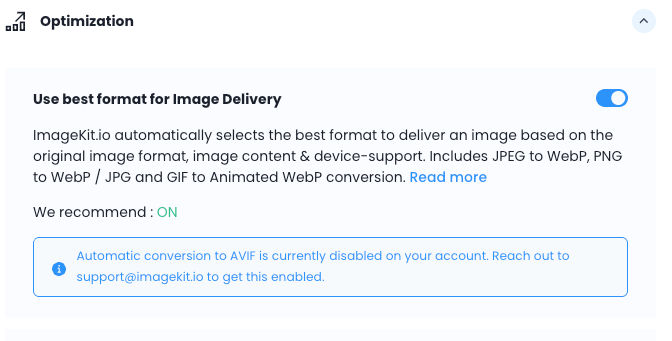
AVIF is enabled per account. Check your ImageKit dashboard under Settings > Images > Optimization > Automatic format conversion to confirm AVIF optimization is available on your account.
Efficiently encode images using automatic compression
ImageKit compresses images on the way out. The default quality is 80 and is configurable globally in your dashboard under Settings > Image > Default quality. This is on a scale of 1-100 and balances visual quality and compression well.
You don't need to set anything to get the benefit of this compression. The original JPEG delivered through ImageKit at default settings of format optimization and compression is already significantly smaller.
| Metric | Raw source | ImageKit (WebP, q-60) |
|---|---|---|
| File size | 1.6 MB | 960.3 KB |
| Format (Chrome) | image/jpeg | image/WebP |
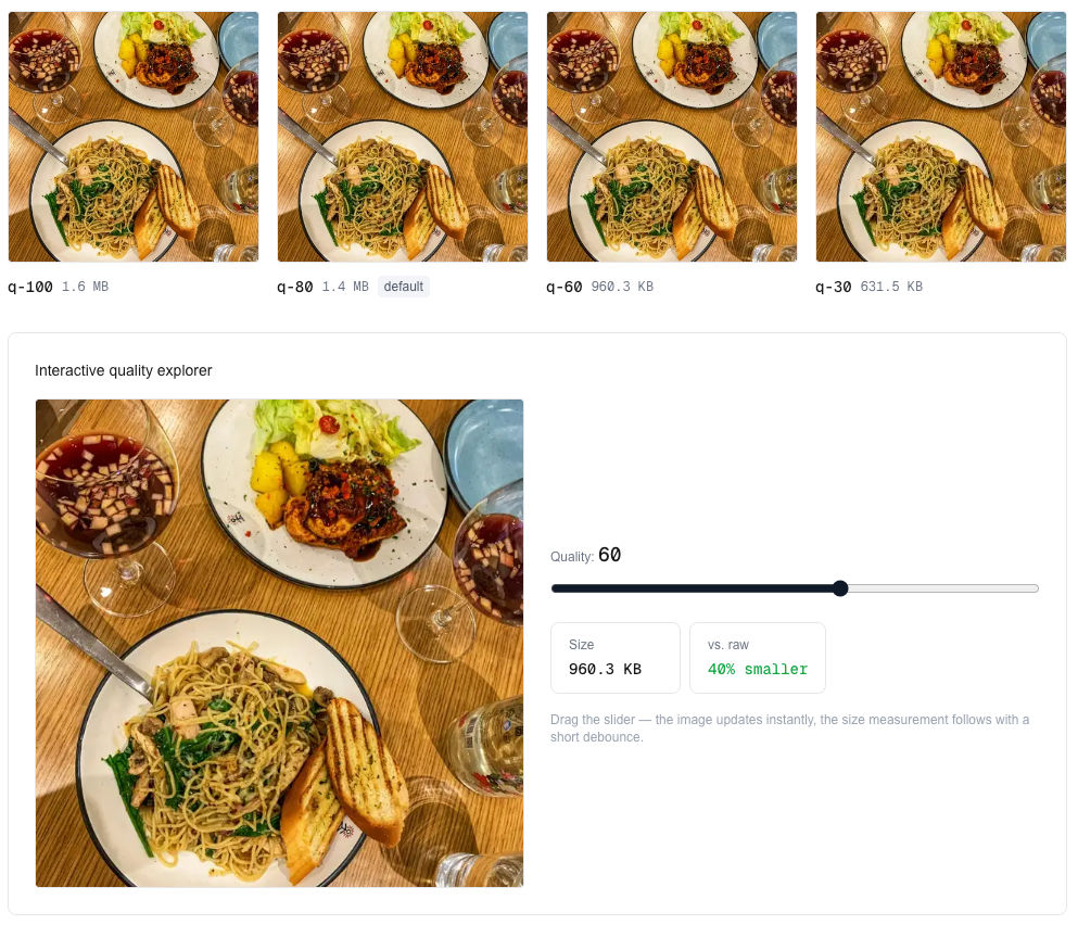
Both format conversion and compression happen on first request and are cached at the CDN edge. Subsequent requests are instant.
You can override the quality on a per-image basis when you need finer control. This is especially useful for low-quality image placeholders (LQIP), increasing compression for users on slower networks, or boosting visual quality for high-detail assets such as product images.
// Higher quality for product detail images
<Image
  src="/docs_images/examples/example_food_3.jpg"
  alt="Product image"
  width={1280}
  height={720}
  transformation={[{ quality: 90 }]}
/>

// Lower quality for listing thumbnails
<Image
  src="/docs_images/examples/example_food_3.jpg"
  alt="Product thumbnail"
  width={300}
  height={300}
  transformation={[{ quality: 60 }]}
/>
Proper image resizing using responsive images
Serving a single image width to all devices wastes bandwidth on mobile and looks soft on retina displays. The sizes prop tells the browser which width to request at each breakpoint.
Because the ImageKit SDK wraps next/image, the sizes prop and srcset generation work exactly as you'd expect:
<Image
  src="/docs_images/examples/example_food_3.jpg"
  alt="Mountain landscape"
  fill
  sizes="(max-width: 768px) 100vw, (max-width: 1200px) 50vw, 33vw"
  transformation={[{ quality: 75 }]}
/>When using fill, the parent element must have position: relative (or absolute / fixed) and a defined height. Otherwise the image will collapse to zero. If you know the intrinsic dimensions of the source image, prefer width and height props instead, as shown in the product grid example below.
next/image generates a srcset with multiple widths. The browser picks the closest match at each breakpoint and requests that size. ImageKit takes care of creating and delivering resized, compressed, correctly formatted images from the CDN.
Responsive images are enabled by default (responsive={true}). If you want to disable automatic srcset generation (for example, when using "Restrict unnamed transformations" security setting), set responsive={false} on the Image component.
For a product grid:
<Image
  src={`/products/${product.slug}.jpg`}
  alt={product.name}
  width={400}
  height={400}
  sizes="(max-width: 480px) 100vw, (max-width: 1024px) 50vw, 33vw"
  transformation={[{ quality: 75 }]}
/>
sizes handles responsive width selection. The browser determines which width to request from the srcset. transformation applies non-resize transforms (quality, crop mode, focus) to every variant in the srcset. Don't set width inside transformation when sizes is already managing responsive widths.
Always set sizes for images that don't span the full screen. Without it, the browser assumes the image fills 100vw and may request a file far larger than what you actually render.
Lazy loading images
Lazy loading is on by default in next/image. The ImageKit Image component inherits this directly. Images below the fold don't load until they scroll into view, with no extra configuration.
For above-the-fold images that should load immediately, use the priority attribute:
<Image
  src="/docs_images/examples/example_food_3.jpg"
  alt="Hero image"
  width={1280}
  height={720}
  priority
/>
Preloading the LCP image
The priority prop does two things: it disables lazy loading and adds a <link rel="preload"> tag in the HTML <head>. This tells the browser to start fetching the image before it even parses the rest of the page.
Use priority on the image that's most likely to be your Largest Contentful Paint element. This is typically the hero image or the above-the-fold banner.
<Image
  src="/docs_images/examples/example_food_3.jpg"
  alt="Hero banner"
  width={1280}
  height={720}
  priority
  sizes="100vw"
/>
Only one or two images per page should have priority. Adding it to every image defeats the purpose by competing for bandwidth. For everything below the fold, let the default lazy loading do its job.
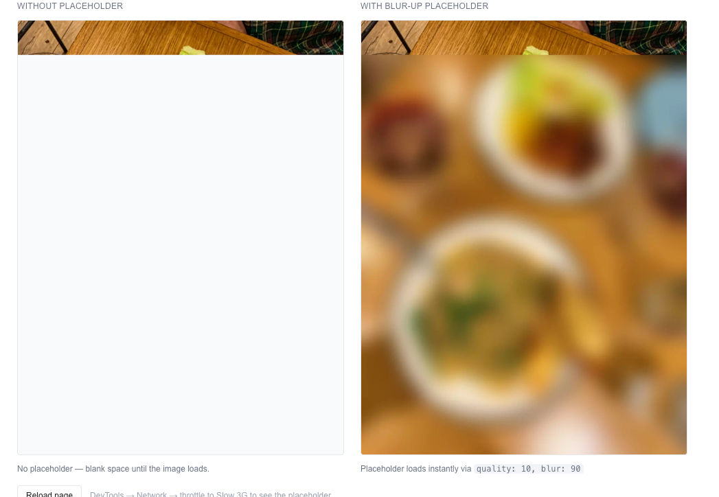
Improving lazy loading with a blur-up placeholder
A blank space while an image loads is jarring, especially above the fold. You can show a blurred low-quality version of the image while the full one loads.
Use buildSrc to generate the placeholder URL and apply it as a CSS background image via the style prop. Once the full image loads, remove the background.
'use client';

import { Image, buildSrc } from '@imagekit/next';
import { useState, useCallback } from 'react';

const urlEndpoint = process.env.NEXT_PUBLIC_IMAGEKIT_URL_ENDPOINT!;

// Generate low-quality placeholder URL outside component to avoid recreating on every render
const placeholderSrc = buildSrc({
  urlEndpoint,
  src: '/docs_images/examples/example_food_3.jpg',
  transformation: [{ quality: 10, blur: 90 }],
});

export default function ProductImage() {
  const [showPlaceholder, setShowPlaceholder] = useState(true);

  const handleLoad = useCallback(() => setShowPlaceholder(false), []);

  // Handles cached images where onLoad won't fire
  const imgRef = useCallback((img: HTMLImageElement | null) => {
    if (!img) return;
    if (img.complete) setShowPlaceholder(false);
  }, []);

  // Extract style object to avoid creating new reference on every render
  const placeholderProps = showPlaceholder
    ? {
        style: {
          backgroundImage: `url(${placeholderSrc})`,
          backgroundSize: 'cover',
          backgroundRepeat: 'no-repeat',
        },
      }
    : {};

  return (
    <Image
      src="/docs_images/examples/example_food_3.jpg"
      alt="Product image"
      width={800}
      height={600}
      ref={imgRef}
      onLoad={handleLoad}
      {...placeholderProps}
    />
  );
}
The buildSrc utility function generates a blurred, low-quality image URL using ImageKit's transformations with quality: 10 and blur: 90. It's defined outside the component as a constant since it doesn't depend on props or state, avoiding unnecessary recalculation.
The placeholderProps object is computed once per render based on the showPlaceholder state. This pattern avoids creating new object references inline, which would trigger unnecessary re-renders.
The imgRef callback handles cached images where onLoad won't fire: if img.complete is already true on mount, the placeholder is removed immediately.
With server-side rendering (SSR), the image often loads before JavaScript executes, which can delay the onLoad event. This may cause both the placeholder and the actual image to be visible briefly. The imgRef callback mitigates this for cached images.
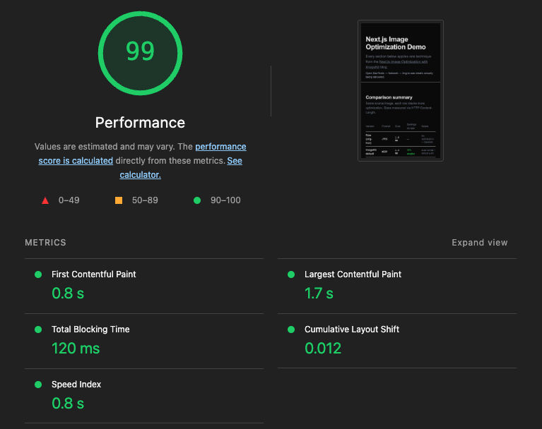
Verifying image optimization using Lighthouse
With WebP/AVIF format conversion, compression, responsive images, and lazy loading in place, we have covered all the basics of optimizing images in a Next.js app. Run Lighthouse again to see the results:
Advanced image optimizations and transformations
When building an image-heavy Next.js application, basic optimizations like resizing and format conversion are just the starting point. In many cases, you'll need more advanced transformations to truly elevate the visual experience for your users.
That's where ImageKit stands out. Beyond being more cost-efficient, it offers 50+ real-time transformations that go far beyond standard optimization.
Smart crop for images
Standard cropping cuts from the edges inward. A landscape photo cropped to a square gives you the center third. If faces or the main subject sit off-center, they get cut.
ImageKit's focus parameter detects the subject and centers the crop around it.
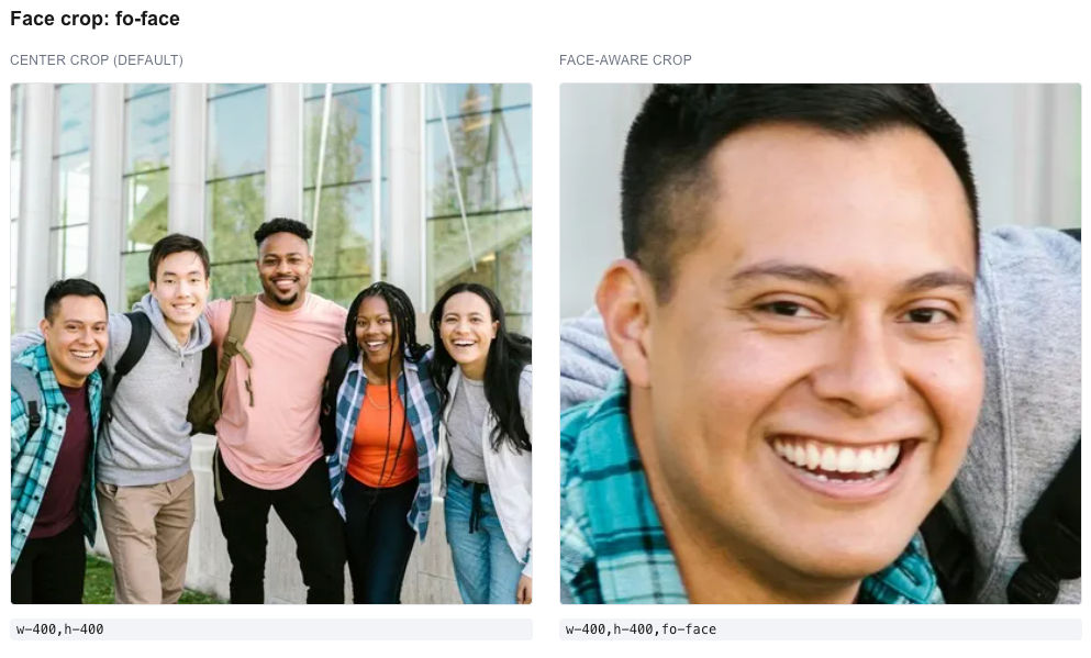
Face crop
fo-face detects faces in the frame and produces a crop centered on them, regardless of where they appear in the original.
<Image
  src="/docs_images/examples/example_fashion_1.jpg"
  alt="Portrait"
  width={400}
  height={400}
  transformation={[{
    width: 400,
    height: 400,
    focus: 'face',
  }]}
/>
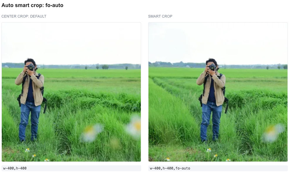
General smart crop
For product images or any content with or without faces, fo-auto detects the main subject:
<Image
  src="/docs_images/examples/example_food_3.jpg"
  alt="Product image"
  width={600}
  height={600}
  transformation={[{
    width: 600,
    height: 600,
    focus: 'auto',
  }]}
/>
Useful for catalog pages where images arrive in different aspect ratios and need to be normalized to a grid keeping the product in the center.
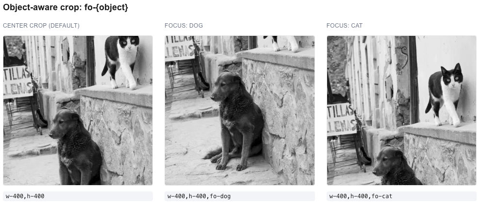
Object-aware cropping
When you know exactly what should be in the frame, you can name the object directly. fo-{object} recognizes 80+ object categories including person, car, dog, cat, bottle, couch, laptop, pizza, and many more.
// Crop a lifestyle photo to focus on the couch
<Image
  src="/lifestyle/living-room.jpg"
  alt="Living room with couch"
  width={600}
  height={600}
  transformation={[{
    width: 600,
    height: 600,
    focus: 'couch',
  }]}
/>
You can also pass multiple objects separated by an underscore in the raw parameter, and ImageKit will crop around the first match it finds in the image. Useful when the asset could contain any of several subject types:
transformation={[{
  width: 600,
  height: 600,
  raw: 'fo-truck_car_train', // Use raw parameter for multiple focus objects
}]}
This is especially powerful for apps where developers upload photos with varied framing and you need to normalize them to consistent thumbnails.
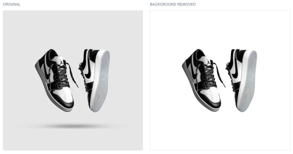
AI transformations
ImageKit provides AI-powered transformations as URL parameters. Two that are particularly useful for product imagery are background removal and extending the image background using generative fill.
Background removal
<Image
  src="/docs_images/examples/example_food_3.jpg"
  alt="Product image"
  width={500}
  height={500}
  transformation={[{ aiRemoveBackground: true }]}
/>
aiRemoveBackground (which generates e-bgremove in the URL) strips the background and outputs a transparent PNG. For higher accuracy using a third-party service powered by remove.bg, use aiRemoveBackgroundExternal: true, which generates e-removedotbg.
The Next.js SDK provides TypeScript-typed properties for AI transformations including aiRemoveBackground, aiUpscale, aiDropShadow, aiChangeBackground, aiVariation, and aiRetouch. For transformations that don't have a typed property yet, like generative fill below, use the raw parameter to pass the transformation string directly.
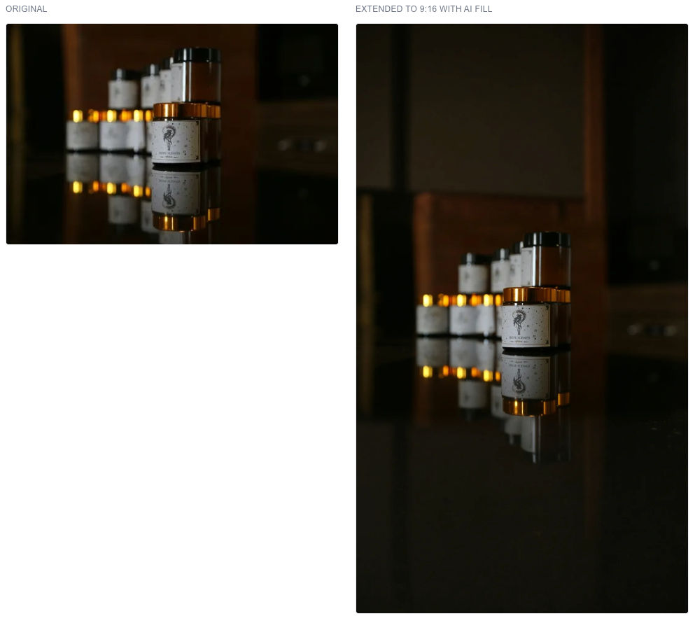
Generative fill
When you need an image to fit a different aspect ratio, traditional resizing either crops content or adds solid padding. Generative fill expands the image boundaries with AI-generated content that blends with the original.
This is especially useful for responsive layouts. A square product image designed for desktop might need to become 9:16 for a mobile hero section. Instead of cropping the product or leaving blank space, generative fill extends the background naturally.
<Image
  src="/docs_images/examples/example_food_3.jpg"
  alt="Product image - mobile hero"
  width={1080}
  height={1920}
  transformation={[{
    width: 1080,
    height: 1920,
    cropMode: 'pad_resize',
    raw: 'bg-genfill', // Generative fill uses raw parameter
  }]}
/>
The original image is placed inside the 1080x1920 frame. cm-pad_resize preserves the full original content and determines where padding is needed. bg-genfill fills that padding with AI-generated content that matches the scene.
You can optionally guide the generation with a text prompt:
transformation={[{
  width: 1080,
  height: 1920,
  cropMode: 'pad_resize',
  raw: 'bg-genfill-prompt-clean white studio background', // Add text prompt to guide generation
}]}
AI transforms are in beta and take longer to process than basic transforms (seconds to a minute depending on complexity). Generate them before going live rather than on first request. See the AI transformation docs for the full list.
Conclusion
Switching from next/image to the ImageKit SDK is a one-line import change and a provider wrapper. From that point, every image gets AVIF/WebP delivery, automatic compression, responsive srcset generation, lazy loading, and access to the full transformation API without changing how you write your components.
Sign up for a free ImageKit account and try fo-face on a group photo.


