Holiday season 2019 is upon us, and the stage is lit on fire.
But.
Stellar frontend layout, immaculate product placement, aggressive discounts, even the best-designed marketing campaigns will fail you if your website is falling behind in performance standards.
The holiday season is where people loosen up their purse strings and tighten their standards. With increasingly short attention spans and even lower patience thresholds, the bounce rate rises exponentially with each passing second your website takes to load.
Online shopping raked in a whopping $7.4 billion in revenue on just Black Friday ‘19 in the US alone.
Will a lax website cut it anymore?

OPTIMIZE.
Yes, yes, you’ve heard it everywhere. It’s THE buzzword. But have you done it? To what extent?
There is more to optimization than just A/B tests, banner designs, and placements. You need to dive deeper into the workings of your website and plug the holes in your customer experience.
MAKE IT MOBILE
Of the online revenue that came in Black Friday 2019, $2.9 billion came in by transactions made with a smartphone. 61% of all digital retail transactions were made with a smartphone, as were 39% of the ecommerce sales.
What you have to do is optimize your website for mobile users.
AMPs
For better user experience, adopt AMPs or Accelerated Mobile Pages for your website. And though not confirmed, AMPs are supposed to be a factor for Google rankings.
Apart from the SEO benefits AMPs may come with, they come with the advantage of faster webpage load times.
AMP is an open source initiative project aiming to make mobile-friendly pages load even faster, and you can use the AMP plugin to render webpages with optimized HTML doing just that.
You can check this out for more on AMPs.
RESPONSIVE IMAGES
Responsive websites are not enough, the images have to be responsive too.
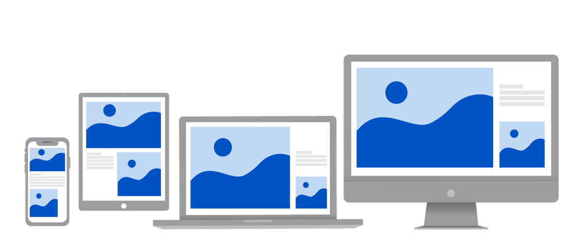
Relying on browser-side resizing for responsiveness is a recipe for disaster.
If you’ve not prepared your images for the various viewports, they will be served in their original sizes.
What a colossal waste of bandwidth and time!
Your users don’t have the budget to spend too much of either on you.
A 2120 pixel wide image is needed for a desktop website, but that is a redundant resolution and size for an image that is to be served on a mobile screen.
Add to that, serving it is not only costing your users in bandwidth consumption and page load time, but you too are paying a price on bandwidth costs.
Optimize and resize your images based on the devices they will be viewed from. Check this out to know how to deliver responsive images across the various devices.
IMAGE OPTIMIZATION
Images being one of the heaviest files on your website need special attention. They have the power to affect your website performance dramatically, and unoptimized images do just that.
And when you’re optimizing your images this sale season, with all that is already happening, it is also important to use a tool or service which does the job in real-time.
IMAGE SIZE
The size and hence, the weight of your images has a considerable impact on your website speed and performance. The bigger the image file, the slower your website will be.
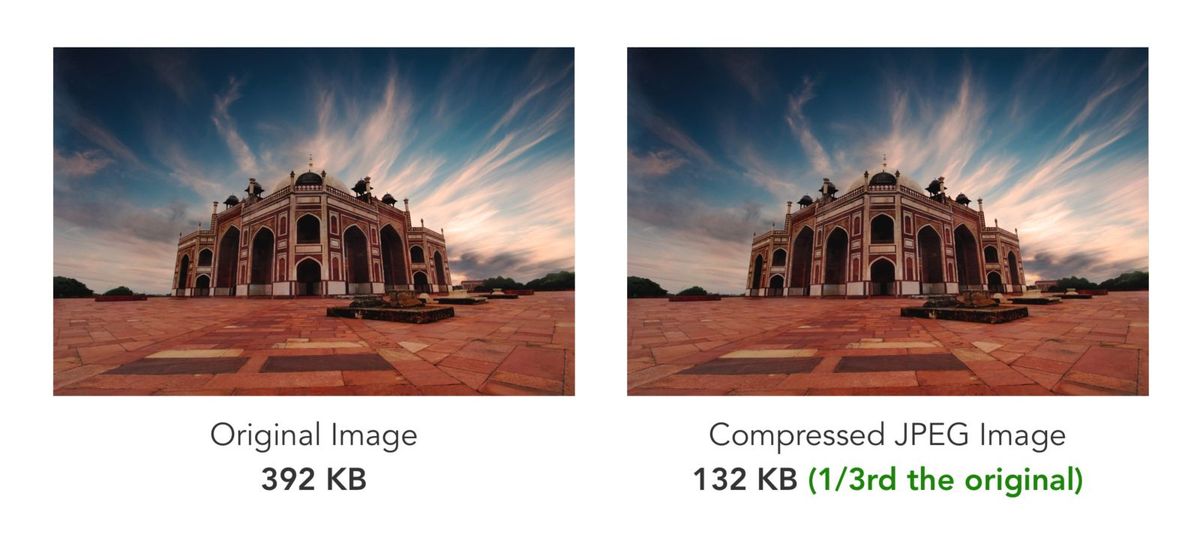
Optimizing image size is a definite, but there needs to be a balance struck between size and quality. While reducing image size, you need to ensure the image quality has not been compromised.
This holds especially true for ecommerce stores.
A website whose entire business is based on how its products look can not serve low-quality product images.
IMAGE FORMAT
The size has an impact, yes, but so does the format you are serving your images in.
There is no universally correct image format.
Each format has its own nuances and is based on their file type and use case. For example, PNG is best suited for images with transparency, particularly in logos, while JPGs are best suited for photographs.
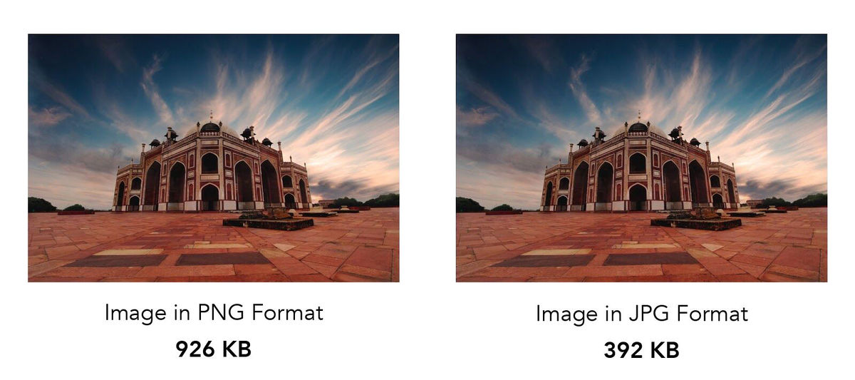
A heavier image will consume more bandwidth and take longer to load slowing your page speed, hence the importance of choosing the right image format for your images.
Apart from having an effect on the page load speed, the image format also has an impact on the quality of image compression, thus making optimization of image formats a necessary step in your website performance optimization strategy.
LAZY LOADING
Loading all the images on the webpage at the same time will only consume more bandwidth and lower the page load speed.
When loading the page, prioritize content based on its consumption. There is no need to load assets below the page fold at the same time the ones above the fold are being loaded.
The assets above the fold need to be prioritized.
Here is a detailed guide on lazy loading.
SERVER SIDE UP
Being the biggest sale season of the year, it is a given that the traffic on your website is going to be heavy. Heavy might just be an understatement even, especially if you’re an ecommerce store.
For such traffic inflows, you need to ensure your servers are up and running, and capable of handling the load.
Fix any 404 errors and broken links, and minimize the number of page redirects on your website. You don’t want your marketing budget to go to waste especially during the sale season.
ASSET DELIVERY
When talking about hosting and serving website assets, we need to talk about their delivery as well.
A 1-second delay in page response can result in a 7% reduction in conversions. Latency is a conversion killer.
Steps need to be taken to control and minimize the delivery of all website assets, especially images, which prove to be a substantially heavy asset on your webpages.
And with online shopping being the rage, images are the most significant asset, and hence the absolute need to have the best ones on your pages and apps.
The best way to keep latency in check is to use a CDN.

Cutting down on the distance between the asset server and storage, and the user will not only reduce the time assets take to deliver, but also reduce the load on your servers.
BROWSER CACHING
If we’re talking about reducing latency, it seems necessary to talk about every tool we can leverage for that express purpose. Browser caching is one such vital tool.
Allowing for JS, CSS, and images files to be stored in the local browser cache helps your website load faster on every subsequent visit.
This also allows other pages on your website and app to load faster even on the same visit as files like logos, headers, footers, and other assets that are common across the website have already been cached by the browser when the visitor landed on the website in the first instance.
FINAL THOUGHTS
Website performance affects user experience, and hence, the measure that converts to revenue for you. A relaxed approach towards your page speed will only cost you in conversions, and if the numbers are anything to go by, that’s something you just can not afford this holiday season.
‘Tis the season to pull up your socks and get optimizing.


