Responsive Images
A Reference Guide from A to Z
- Chapter 1 - What is responsive images?
- Chapter 2 - Why do we need responsive images?
- Chapter 3 - How to make images responsive?
- Chapter 4 - Srcset
- Chapter 5 - Srcset with sizes
- Chapter 6 - Art direction using picture element
- Chapter 7 - Automate responsive images using client hints
- Chapter 8 - Responsive images in CSS
- Chapter 9 - Lazy load responsive images
- Chapter 10 - How to verify responsive image implementation?
- FAQs
Last updated - 17 Apr 2025
Chapter 1 - What is responsive images?
In this guide, you'll learn everything you need to know about responsive images, with practical examples included. A basic understanding of HTML and CSS is recommended. By the end, you'll be equipped with the latest tools and techniques to implement responsive images the right way.
Responsive images are a set of techniques used to load the right image based on device resolution, orientation, screen size, network connection, and page layout. The browser should not stretch the image to fit the page layout, and loading it shouldn’t result in wasted time or bandwidth. This improves user experience, as images load quickly and look crisp to the human eye.
Quick example of responsive images in HTML
The best way to understand responsive images is with a quick example. For simplicity, we will load a 2200px wide image on different devices. Everything else remains the same except for the viewport size.
The markup would be:
<!-- The width of the original image is 2200px -->
<img src="image.jpg" />
For desktop (iMac), the image is optimal because the width of the viewport and the image match.
However, on mobile, as we can see, the viewport is only 375 CSS pixels wide. The same is true for the tablet, where the viewport is only 1024 CSS pixels wide. We are wasting time and bandwidth downloading this overly large file.
What’s happening?
This is a simplified example of responsive images in action.
We used the srcset attribute to provide the browser with three image options at different sizes. The browser then chose the most appropriate one based on the device’s actual viewport size. We’ll dive deeper into srcset and other techniques shortly.
Note: In this example, the browser assumes the image will span the full width of the viewport. Later in this guide, we’ll explore the
sizesattribute, which tells the browser how wide the image is expected to appear in the layout.
Chapter 2 - Why do we need responsive images?
As you saw in the above example, one size doesn’t fit all. A responsive design should adapt based on user screen size, pixel density, and device orientation to ensure a great user experience.
Here are the three main reasons to implement responsive images:
- Render high-quality images on different devices
- Load the right image (art direction)
- Faster loading web pages
Let's look at each of these in detail.
1. Render high-quality images on different devices
An image without visible artifacts looks crisp and contributes to a great user experience. This is especially important on retail sites, where users expect to view high-resolution closeups of product images to better see texture and details.
For an image to look good, it must adapt based on viewport width and screen pixel density. Let’s look at these cases:
Different viewport width
If your layout changes based on the device viewport, the loaded image dimensions should match the container's CSS/HTML width. If the browser stretches a smaller image to fit the design, the rendered image will look blurred. If you load a larger image on a device with a small viewport width, it results in wasted bandwidth and time.
Different pixel density
High-resolution displays pack more pixels into the same physical space. Because of this higher pixel density, they require images with a greater number of pixels. In other words, to occupy the same physical area on a high-resolution screen, you need a larger image.
Consider the iPhone SE (2022):
- CSS viewport size: 375px by 667px
- Pixel density (DPR): 2
- Effective device resolution: 750px by 1334px
If you want an image to appear 100 CSS pixels wide on this device, you need to provide an image that is 200 pixels wide to maintain sharpness.
What about ultra-high-resolution devices?
You can stick to 2× images. This is because most modern OLED screens (including those on the iPhone 14 Pro) use a PenTile subpixel layout, where only the green subpixels truly render at 3×. Red and blue subpixels effectively run at about 1.5×, making a 3× image look no sharper than its 2× counterpart—yet consume significantly more data.
Also, “larger in pixel dimensions” doesn’t have to mean a “larger file size.” On a 2× screen, a 200px-wide image at moderate quality (e.g., 50) often looks sharper than a 100px-wide image at high quality (e.g., 90), even if both result in similar file sizes. By choosing 2× images and adjusting the quality settings, you can achieve a crisper look without sacrificing performance. That means, for most devices, it’s best to stick to just 1× and 2× image variants. Going beyond 2× usually doesn’t improve visual quality but significantly increases data usage.
Twitter reduced image data usage by one-third by capping image fidelity on ultra-high resolution devices—without any noticeable drop in quality. Read more.
2. Load the right image (art direction)
When a large image is resized to fit a small area, it can lose its relevance, usefulness, and legibility. The most important part might get cropped.
For example, consider this screenshot of a dashboard on a product landing page. It highlights different elements of the user interface to a potential user.
On the desktop, the above image is perfect. However, if we downscale the same image to fit a mobile viewport, we lose many essential elements of the page.
In this case, a different image might have been more appropriate, for example:
This is called art direction. By "art directing", you can explicitly decide which image should be shown based on the image's size on the page. We will cover this technique in more detail soon.
You can also use this to show different images on a mobile device based on orientation—landscape vs. portrait mode.
Using AI-powered smart cropping can help you create an engaging visual experience without needing to create multiple versions of an image. Smart cropping uses AI to analyze the image and automatically crops it to focus on the most important part. Additionally, if you know which objects you want to focus on, you can use AI-based object cropping in ImageKit.io to automatically crop the image around the object of interest.
3. Faster loading web pages
According to HTTP Archive data, on average, 64% of a website’s page weight is made up of images. With mobile traffic surpassing desktop traffic, it has become even more crucial to optimize images for different device sizes.
Ideally, you want to serve images that are resized to match the user’s viewport dimensions. Without a way to do this, you have to send an overly large image to all users. This means that a user on a mobile device with a small viewport width has to download extra data, which slows down the page load. This wastes time, bandwidth, and money, and degrades the overall user experience.
Chapter 3 - How to make images responsive?
There are many methods for implementing responsive images. We have come a long way from using hacky JavaScript-based solutions to having native support in modern browsers.
In this chapter, we’ll explore the most widely used techniques:
-
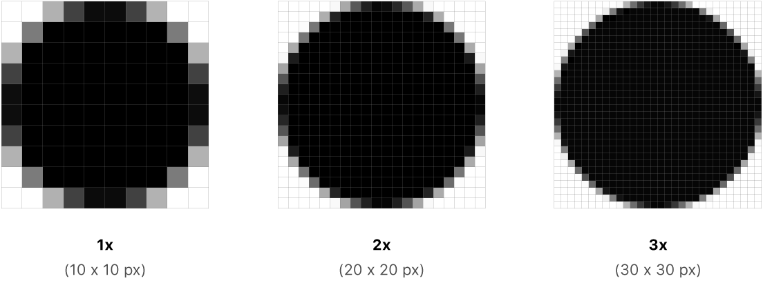
srcsetwith pixel density descriptors is useful for images that stay the same size across screen sizes—like a logo. You can provide multiple resolution variants (e.g.,1x,2x), and the browser selects the most suitable one based on the device’s pixel density. -
srcsetwithsizesis ideal when the image size changes across different screen widths—such as in a multi-column layout that collapses on mobile.srcsetprovides the image options, whilesizestells the browser how wide the image will be at each breakpoint, helping it choose the most appropriate version. -
The
<picture>element is helpful when you want to serve entirely different images depending on the screen size (known as art direction), or use newer formats like WebP or AVIF on supported devices. -
Client hints are great when you want to offload image selection logic to the server without changing the HTML too much. It requires some server configuration but keeps your markup clean.
-
Responsive images in CSS are used when images are loaded as CSS background images instead of inline HTML.
Each method has its use case, and we’ll look at them one by one.
But first, let's talk about why a simple img tag with CSS is not enough. Why do we need srcset, sizes, or the <picture> element?
To understand this, we need to know how the browser loads a web page.
How the browser loads a webpage — the old way
A web page is made up of text, CSS, JS, and fonts. A lot happens in the background once you hit enter, and a page is finally rendered on your screen.
- First, the HTML is downloaded, and the browser starts parsing it. If it comes across an external stylesheet, it starts downloading it in parallel and continues parsing HTML.
- If it comes across an inline
<script>tag, it pauses the HTML parsing and executes the script right away. - If it comes across a
<script>tag (one without thedeferorasyncattribute) that points to an external URL, it pauses the HTML parsing and first downloads and executes that JavaScript resource. - If it comes across an
<img>tag, it starts downloading the image resource in parallel and continues parsing HTML. - Once all blocking external stylesheets and JavaScript are downloaded, parsed, and executed, the page is rendered.
For example, if we have HTML like this:
<script src="vendor.js"></script>
<script src="app.js"></script>
<script src="zoom.js"></script>
<img src="image1.png" />
<img src="image2.jpg" />
The browser loads resources like this:
Pausing the parser whenever a script is encountered results in sub-optimal use of the browser’s ability to download multiple external resources over the network in parallel. This method is delaying the download of resources required to render the page.
Pre-loaders or speculative parsing to rescue - the new way
Internet Explorer, WebKit, and Mozilla all implemented pre-loaders in 2008 to improve the low network utilization problem that we just discussed.
Essentially, the idea is that the browser cannot build DOM while executing a script but can still parse the rest of the markup looking for other resources, for example, stylesheets, javascript files, or images that are linked. These files are added to a list and start downloading in the background. By the time all scripts execute and HTML parsing finishes, hopefully, the browser has already downloaded these resources, and there won’t be any further delay.
The waterfall chart for the example above now looks like this:
The standard <img> tag lets you define only a single image source using the src attribute. The browser needs more information about the image size and layout to make the right calculations and eagerly download the right image. This is where srcset and sizes come into play.
Chapter 4 - Srcset
The srcset attribute allows you to provide multiple image sources for a single <img> element, along with hints—called descriptors—that guide the browser on which image to load. These descriptors help the browser make an informed decision based on factors like the device’s screen resolution (pixel density), the size of the viewport, and how the image is expected to appear in the layout.
Instead of forcing a one-size-fits-all image, srcset gives the browser flexibility. For example:
<img src="image.jpg"
     srcset="image_1x.jpg 1x, image_2x.jpg 2x">
In this case, the browser will choose between the 1x and 2x versions depending on the device's pixel density (DPR).
Each entry in a srcset list has three parts:
- The image URL, which can be absolute (e.g., https://...) or relative (e.g., /images/...).
- A space separates the URL from the descriptor.
- The descriptor, like
1xor2x.1xis implied if not specified.
This is straightforward. In most cases, if you have a fixed-width image, you can use the srcset attribute with pixel density descriptors.
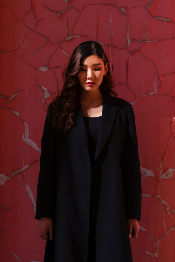
Demo - srcset with density descriptor
Let’s see this in action with a live demo: https://imagekitio.github.io/responsive-images-guide/srcset-density.html.
<img
  src="https://ik.imagekit.io/ikmedia/paddy.jpg"
  srcset="https://ik.imagekit.io/ikmedia/paddy.jpg?tr=w-300 1x,
          https://ik.imagekit.io/ikmedia/paddy.jpg?tr=w-600 2x,
          https://ik.imagekit.io/ikmedia/paddy.jpg?tr=w-900 3x"
>
Using the device emulator in Chrome, at DPR 1, the image's currentSrc is https://ik.imagekit.io/ikmedia/paddy.jpg?tr=w-300
Similarly, if we consider different DPR values:
| DPR value | Image picked by browser (currentSrc) |
|---|---|
| 1 | https://ik.imgkit.net/ikmedia/paddy.jpg?tr=w-300 |
| 2 | https://ik.imgkit.net/ikmedia/paddy.jpg?tr=w-600 |
| 3 | https://ik.imgkit.net/ikmedia/paddy.jpg?tr=w-900 |
In most real-world applications, image sizes aren’t fixed—they adjust based on the viewport. For example, an image might span the full width in a single-column mobile layout but occupy only one-third of the width in a three-column desktop layout.
This variability is where the sizes attribute becomes crucial. It tells the browser how wide the image will be in the layout, allowing it to select the most appropriate image from the srcset.
Chapter 5 - Srcset with sizes
The combination of srcset and sizes is especially useful when image width changes across different viewport sizes. The sizes attribute is a comma-separated list of media conditions and corresponding image display widths.
By providing this information upfront, the browser can choose and begin downloading the optimal image immediately, without having to wait for CSS to load and be parsed.
Why do we need sizes? If you scrolled here directly and are wondering why the browser is not aware of how big the image will render, check out how the browser loads a web page.
The syntax is:
<img src="image.jpg"
     srcset="small.jpg 300w,
             medium.jpg 600w,
             large.jpg 900w"
     sizes="(max-width: 300px) 100vw, (max-width: 600px) 50vw, (max-width: 900px) 33vw, 900px" />
Each comma-separated item in sizes has:
- A media condition, for example,
(max-width: 300px)— This describes a possible state that the screen can be in.(max-width: 300px)means when the viewport width is 300 CSS pixels or less. It is similar to media queries but with some limitations; you cannot usescreenorprint. - A space.
- The width of the image element when the media condition is true. You can provide an absolute length (px, em) or a length relative to the viewport (vw), but not percentages.
With both srcset and sizes defined, the browser follows this process:
- It considers factors like screen size, pixel density, zoom level, orientation, and even network conditions.
- It scans the
sizeslist and finds the first media condition that matches the current environment. Only the first match is used—any conditions after that are ignored, so the order matters. - It then determines the expected display width (slot size) for the image based on that matching condition.
- Finally, it looks at the
srcsetlist and chooses the image that most closely matches the slot size. If there’s no exact match, it selects the next larger image available.
Demo - srcset with sizes
Let’s see this in action with a live demo - https://imagekitio.github.io/responsive-images-guide/srcset-sizes.html
The layout is such that:
- If viewport width is above 900px, each image takes a fix 225px width.
- Upto 900px, each image takes up 33vw i.e. 33% width of total viewport width.
- Upto 700px, each image takes up 50vw i.e. 50% width of total viewport width.
- Upto 400px, each image takes up 100vw i.e. the whole viewport width.
HTML markup of a single image element looks like this:
<img src="https://ik.imgkit.net/ikmedia/women-dress-1.jpg"
     srcset="https://ik.imgkit.net/ikmedia/women-dress-1.jpg?tr=w-225 225w,
             https://ik.imgkit.net/ikmedia/women-dress-1.jpg?tr=w-300 300w,
             https://ik.imgkit.net/ikmedia/women-dress-1.jpg?tr=w-350 350w,
             https://ik.imgkit.net/ikmedia/women-dress-1.jpg?tr=w-640 640w"
     sizes="(max-width: 400px) 100vw, (max-width: 700px) 50vw, (max-width: 900px) 33vw, 225px" />
Let’s see what happens at different screen size and DPR values -
| Viewport width | DPR value | Image size required (width × DPR) | Image picked by the browser (currentSrc) |
|---|---|---|---|
| 350px | 1 | 100vw i.e. 350 × 1 = 350px | https://ik.imgkit.net/ikmedia/women-dress-1.jpg?tr=w-350 |
| 350px | 2 | 100vw i.e. 350 × 2 = 700px | Closest candidate is https://ik.imgkit.net/ikmedia/women-dress-1.jpg?tr=w-640 |
| 650px | 1 | 50vw i.e. (650/2) × 1 = 325px | Closest candidate is https://ik.imgkit.net/ikmedia/women-dress-1.jpg?tr=w-350 |
| 1024px | 1 | 225 × 1 = 225px | https://ik.imgkit.net/ikmedia/women-dress-1.jpg?tr=w-225 |
| 1024px | 2 | 225 × 2 = 450px | Closest candidate is https://ik.imgkit.net/ikmedia/women-dress-1.jpg?tr=w-350 |
How to choose breakpoints for srcset and define sizes?
When implementing responsive images, you will need to write the values for the srcset and sizes attributes. This can quickly get tricky. So let’s repeat the purpose of these two attributes to make it easier to derive the values:
srcset— Defines multiple image sources of different widths and lets the browser pick the most appropriate candidate during HTML parsing.sizes— Defines the size of the image element. It could be a fixed size like225pxor relative to the viewport. You can use CSS media conditions here to provide different size values based on the viewport width.
Before you provide different image sources in srcset, you need to understand what sizes you need based on the layout. This is site-specific, meaning it is closely tied to your CSS.
Here is a simple approach to this problem: While calculating sizes, think in terms of image width relative to the viewport. For example: “My layout is such that my image is going to be roughly X percent of the viewport if the screen size is above Y px.”
Let’s understand this with a few examples.
sizes="(min-width: 1024px) 33vw, 95vw"It means - “The image is in a three-column layout on a screen larger than 1024px. Otherwise, it is close to full viewport width leaving some space around it”.
Now, let’s pick the sizes from our demo - https://imagekitio.github.io/responsive-images-guide/srcset-sizes.html
sizes="(max-width: 400px) 100vw, (max-width: 700px) 50vw, (max-width: 900px) 33vw, 225px"It means -
- If viewport width is upto 400px, each image takes up 100vw i.e. the whole viewport width.
- Upto 700px, each image takes up 50vw i.e. 50% width of total viewport width.
- Upto 900px, each image takes up 33vw i.e. 33% width of total viewport width.
- Above 900px, each image takes a fix 225px width.
Defining image width relative to viewport does not always provide the most optimal image considering many devices & corresponding viewport width & DPR values. However, it is a practical solution.
Once we know the value of sizes, it is easy to find out what all different size images we need to define in srcset -
| Image size candidates from sizes | Effective size at different DPR values (width × DPR) |
|---|---|
| 400px From the first media condition i.e. max-width: 400px) 100vw | 400px at 1x 800px at 2x 1200px at 3x |
| 350px From the second media condition i.e. (max-width: 700px) 50vw | 350px at 1x 700px at 2x 1025px at 3x |
| 300px From the third media condition i.e. max-width: 900px) 33vw | 300px at 1x 600px at 2x 900px at 3x |
| 225px From the fourth default media condition i.e. 225px | 225px at 1x 450px at 2x 675px at 3x |
If you sort the effective sizes, here is what you will get -
225px, 300px, 350px, 400px, 450px, 600px, 675px, 700px, 800px, 900px, 1025px and 1200px.
If you are using an image CDN like ImageKit.io, it is easy to provide images in different dimension by addign URL parameters e.g.
225pxwide image - https://ik.imgkit.net/ikmedia/women-dress-1.jpg?tr=w-225300pxwide image - https://ik.imgkit.net/ikmedia/women-dress-1.jpg?tr=w-300600pxwide image - https://ik.imgkit.net/ikmedia/women-dress-1.jpg?tr=w-600
However, you don’t have to provide images at all required sizes in srcset. You can select a few candidates, and the browser will pick the closest one. This serves two purposes:
- You don’t have to generate and store multiple variants of the same image.
- If you are using a CDN for faster delivery and caching, then having a few variants will improve your cache hit ratio as the repeat request will increase.
So you can pick three or four candidates and write srcset like this:
srcset="https://ik.imgkit.net/ikmedia/women-dress-1.jpg?tr=w-225 225w,
        https://ik.imgkit.net/ikmedia/women-dress-1.jpg?tr=w-350 350w,
        https://ik.imgkit.net/ikmedia/women-dress-1.jpg?tr=w-700 700w,
        https://ik.imgkit.net/ikmedia/women-dress-1.jpg?tr=w-900 900w"
Tips for choosing breakpoints while writing srcset
- You can look at your Google analytics device report to see what screen resolutions you should care about most. Accordingly, you will know which layout needs the most optimization. For example, assuming that 60% of the users on your website see a three-column layout and 20% see a single column layout. Then you can consider all size variations you need for these two layouts at multiple DPR values and write
srcset. - To increase cache hit ratio on CDN, don’t try and provide
srcsetfor all possible breakpoints and sizes. CDN cannot cache all your resources. Some resources have to evict to make space for others. This would cause more performance bottlenecks than gains. - When in doubt - First think about your layout, i.e. CSS ➡️ , then accordingly write
sizes➡️ And finally choose breakpoints forsrcsetconsidering different DPR values and effective image sizes you need 🙌.
Chapter 6 - Using picture element
The srcset and sizes attributes are perfect when you're delivering the same image in different resolutions or sizes. They help the browser pick the most appropriate variant based on screen size and pixel density.
However, when the content of the image itself needs to change—say, cropping differently for mobile vs. desktop, or using entirely different visuals for different screen sizes—you need the <picture> element.
This approach is known as art direction. It lets you specify completely different image files depending on media conditions. For example, you might show a tightly cropped headshot on mobile and a wide landscape shot on desktop. Or, you can serve WebP or AVIF formats when supported, and fall back to JPEG or PNG otherwise.
The <picture> element gives you fine-grained control over what image to show, not just how big or sharp it is.
When to use the picture element
The <picture> element should be used to achieve:
- Art direction
- Different format support
- Color theme example
The syntax:
<picture>
  <source srcset="/large.jpg" media="(min-width: 800px)">
  <source srcset="/small.jpg" media="(min-width: 400px)">
  <img src="/large.jpg" />
</picture>
<picture> element consists of zero or more source and one img element. The browser will consider each source element to choose the best match based on device display and image format support.
Each source accepts media and type attributes in addition to well known srcset and sizes.
Media attribute
media attribute contains a media condition like CSS media query. If a source’s element media condition evaluates to false, the browser skips that source. If none of the source element’s media conditions evaluate to true, the browser loads the image specified in the img tag.
Example - Loading different based on screen size
<picture>
  <source srcset="/large.jpg"
          media="(min-width: 800px)">
  <source srcset="/small.jpg"
          media="(min-width: 400px)">
  <img src="/large.jpg" />
</picture>
The browser will pick one of the source elements based on the media condition.
Srcset attribute
The srcset attribute is the same as we discussed before. It contains a comma-separated list of different image resources.
Each comma-separated item in srcset has:
- Image URL, e.g.
http://ik.imgkit.net/demo/default-image.jpgor relative path/demo/default-image.jpg - An empty space
- The real width of the image:
- Either using display density descriptor e.g.
1.5x,2xetc. - Or, using width descriptors e.g.
450w. This is the width of the image in pixels.
- Either using display density descriptor e.g.
Example - Loading different based on device pixel ratio
<picture>
  <source srcset="large_1x.jpg 1x, large_2x.jpg 2x, large_3x.jpg 3x" media="(min-width: 800px)">
  <source srcset="small_1x.jpg 1x, small_2x.jpg 2x, small_1x.jpg 3x" media="(min-width: 400px)">
  <img src="large_3x.jpg" />
</picture>
Type attribute
type attribute specified the MIME type of the resource URL(s) in the source’s srcset. If the browser supports that MIME type, it will load the resource. Otherwise, it will skip that source and move to the next. If none of the source’s type is supported by the browser, the image in img is loaded.
Example - Loading different image format based on browser support
<picture>
  <source srcset="/image.webp" type="image/webp">
  <source srcset="/image.avif" type="image/avif">
  <img src="/image.jpg" />
</picture>
Live demo of using the picture element
Let’s see this in action with a live demo - https://imagekitio.github.io/responsive-images-guide/picture.html
There are two <picture> elements in this demo:
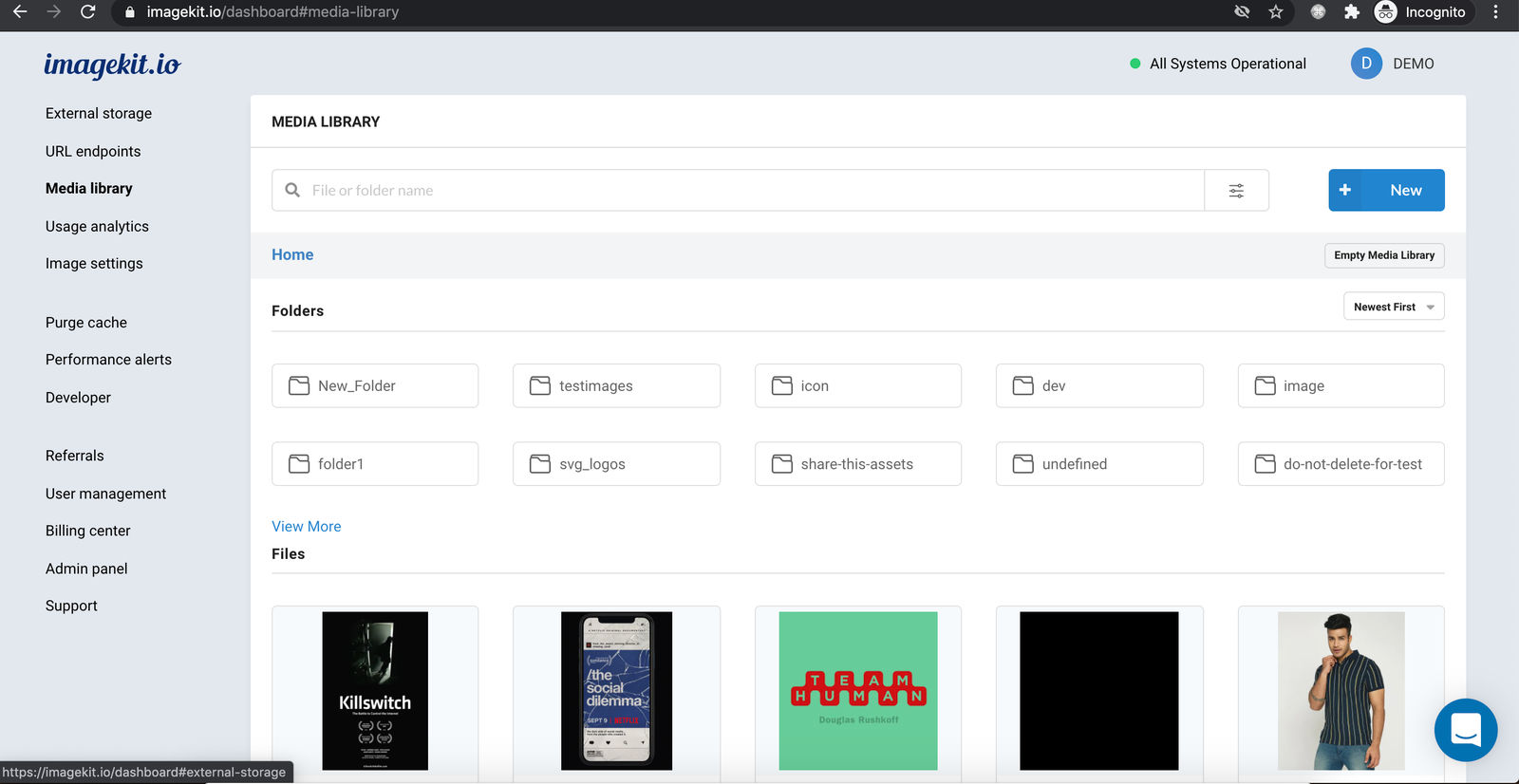
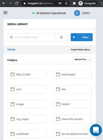
- The first example contains a screenshot of the ImageKit media library to showcase different user interface elements. The interface varies based on screen size. So to depict the same, we are loading a different screenshot based on screen size. For screen size greater than or equal to
800px, you will see a desktop version of the user interface i.e. https://ik.imgkit.net/ikmedia/dashboard.png. Otherwise, you will see a mobile-friendly version i.e. https://ik.imgkit.net/ikmedia/dashboard-mobile.png. - The second example demonstrates loading a WebP format image if the browser has support for it. Otherwise, a JPG image is loaded.
Loading different image in dark mode vs light mode
Dark mode lets you change the background color of an app window to black. As a web developer, you can choose to load a different image if a user has turned on dark mode.
<picture>
  <source srcset="dark.jpg" media="(prefers-color-scheme: dark)">
  <img src="light.jpg" />
</picture>
The browser will evaluate the media condition (prefers-color-scheme: dark), and if it is true, it will pick that source and load dark.jpg.
Here is how it looks, toggle the dark mode setting and refresh the page to see how the browser loads a different image.
Live demo - https://imagekitio.github.io/responsive-images-guide/dark-vs-light-mode.html
Chapter 7 - Using client hints
What are client hints?
Client hints are pieces of information provided by the client device to the server along with the request itself. These hints allow the server to fulfill a particular request with the most optimal resource. This process is known as content negotiation.
Client hints are sent via HTTP request headers. For example:
How to enable client hints?
Not every request has these HTTP headers. You will have to explicitly tell the browser to include these client hints using a meta tag.
<meta http-equiv="Accept-CH" content="Sec-CH-DPR, Sec-CH-Width, Sec-CH-Viewport-Width">This allows the browser to send the Width (the width, in device pixels, of the image container within the responsive layout), DPR value (device pixel ratio) and Viewport-Width (device screen width in CSS pixels) along with image requests.
That’s great. But why do we need client hints in implementing responsive images when we already have srcset and picture?
Why do we need client hints?
To understand the need for client hints, let's review what we've learned so far:
srcsetandsizeslet you define URLs of different image variants and specify the rendered image size so the browser can download the most appropriate image based on the size of the viewport.- The
pictureelement lets you control how the browser loads a differently cropped or entirely different image, which is better suited for a smaller display.
While srcset and picture provide everything needed to implement responsive images, they can be time-consuming to develop and maintain for complex use cases.
All of the above methods require you to modify markup so that, as a web developer, you can pass the essential missing piece of information that the browser needs at runtime to be able to download the right image. Client hints do the same but without complex markup—they provide the missing link between the browser and the server when it comes to layout information and device capabilities.
Let’s understand with an example
Suppose you have a simple resolution switching use cases where you want to load a different size variant of the same image based on the viewport width. The syntax would be -
<img src="image.jpg"
     srcset="small.jpg 300w,
             medium.jpg 600w,
             large.jpg 900w"
     sizes="(max-width: 300px) 100vw, (max-width: 600px) 50vw, (max-width: 900px) 33vw, 225px" />
However, if you want to load a WebP image in a supported browser, your syntax becomes -
<picture>
  <!-- webp format for (max-width: 300px) 100vw -->
  <source media="(max-width: 300px) 100vw"
          srcset="small.webp 300w,
                  medium.webp 600w,
                  large.webp 900w"
          type="image/webp">
  <!-- jpg format for (max-width: 300px) 100vw -->
  <source media="(max-width: 300px) 100vw"
          srcset="small.jpg 300w,
                  medium.jpg 600w,
                  large.jpg 900w">
  <source srcset="/image.avif" type="image/avif">

  <!-- webp format for (max-width: 600px) 50vw -->
  <source media="(max-width: 300px) 100vw"
          srcset="small.webp 300w,
                  medium.webp 600w,
                  large.webp 900w"
          type="image/webp">
  <!-- jpg format for (max-width: 600px) 50vw -->
  <source media="(max-width: 300px) 100vw"
          srcset="small.jpg 300w,
                  medium.jpg 600w,
                  large.jpg 900w">
  <source srcset="/image.avif" type="image/avif">

  <!-- webp format for (max-width: 900px) 33vw -->
  <source media="(max-width: 300px) 100vw"
          srcset="small.webp 300w,
                  medium.webp 600w,
                  large.webp 900w"
          type="image/webp">
  <!-- jpg format for (max-width: 900px) 33vw -->
  <source media="(max-width: 300px) 100vw"
          srcset="small.jpg 300w,
                  medium.jpg 600w,
                  large.jpg 900w">

  <img src="large.jpg" />
</picture>
Yes! It quickly gets complex.
If we use client hints, the above syntax can be reduced to
<meta http-equiv="Accept-CH" content="Sec-CH-DPR, Sec-CH-Width">
...
<img src="/image.jpg" sizes="(max-width: 300px) 100vw, (max-width: 600px) 50vw, (max-width: 900px) 33vw, 225px" />
Pretty amazing, right! No srcset. But for this to work, the server should be capable of understanding client hints and respond appropriately.
We will discuss in detail how this is possible, but the bottom line is — when possible, you should aim to centralize image resizing & processing and automate as much as possible. This is precisely what client-hints do. ImageKit supports client hints out of the box.
Client hints for responsive images
Among others, one of the primary uses of client hints is to send information about the required size of the image in the current page layout. This simplifies the markup and automates a lot of information passing from browser to web server when implementing responsive images.
Let’s put that in perspective by taking a closer look at what all information does the browser need at runtime to be able to load an appropriate image -
- Viewport width.
- How big will the image render? It depends upon your layout, which might adapt based on the width of the viewport.
- Device pixel ratio i.e.
1x,2x,3xor4x. - URL of the image resource for different sizes.
You can opt-in the following client hints, which will be sent as request headers along with HTTP request -
Sec-CH-Width- Final size of the required image in page layout considering device pixel ratioSec-CH-DPR- Device pixel ratioSec-CH-Viewport-Width- Viewport width in CSS pixels.Width- Final size of the required image in page layout considering device pixel ratio (deprecated in favour ofSec-CH-Width)DPR- Device pixel ratio (deprecated in favour ofSec-CH-DPR)Viewport-Width- Viewport width in CSS pixels (deprecated in favour ofSec-CH-Viewport-Width)Accept- This header is always sent with every request by default.Save-Data-onoroffto indicate the user’s preference to receive less data.ECT- Effective Connection Type e.g. **4g,3g,2g, andslow-2g.RTT- Round Trip Time, in milliseconds, on the application layer.Downlink- Approximate downstream speed of the user’s connection in megabits per second (Mbps).
Sec-CH-Width, Sec-CH-DPR, and Sec-CH-Viewport-Width hints are most relevant to responsive images implementation as they allow the webserver to control the image size from the backend.
Accept hint can be used by the server to deliver images in next-generation format e.g. WebP or AVIF, without changing the image source URL or using the <picture> element.
The server can use network hints such as Save-Data, ECT, RTT, and Downlink to deliver a low-quality variant of the image, which will consume less data.
Sec-CH-Width
It provides the final size of the image required as per page layout after factoring in the device pixel ratio. Sec-CH-Width hint is sent with requests for image resources fired off by <img> or <source> tags using the sizes.
This is the most useful client hint with respect to implementing responsive images.
For example - Let’s say a page has an <img> element with the sizes attribute set to 300. This means the layout needs a 300 CSS pixel wide image.
<!-- Allow Width header to be sent -->
<meta http-equiv="Accept-CH" content="Sec-CH-Width">
...
<img src="/image.jpg" sizes="300px" />
Now the browser takes 300 and multiplies it with the device pixel ratio. Assuming device pixel ratio (DPR) is 2, browser sets Sec-CH-Width hint to 600, i.e. 300x2. This is the actual size of the image required for the current layout.
Request headers
GET: /image.jpg
sec-ch-width: 600
This allows the server to respond with an image, which is optimal for this device and the page's current layout.
Sec-CH-DPR
This hint provides the device pixel ratio. It is equivalent to window.devicePixelRatio.
For example - when opted in
<!-- Allow DPR header to be sent -->
<meta http-equiv="Accept-CH" content="Sec-CH-DPR">
...
<img src="/image.jpg" />
Assuming, device pixel ratio is 2, the browser will set the Sec-CH-DPR hint to 2.
Request headers
GET: /image.jpg
sec-ch-dpr: 2
You can use this header on the server to send the right image variant e.g. 1x, 2x or 3x based on the actual device pixel ratio.
Sec-CH-Viewport-Width
This hint provides the viewport width in CSS pixels. It is equivalent to window.innerWidth.
You can use this hint on the server-side to respond with an image that is suitable for a specific screen size. This is useful for implementing an art direction use-case.
For example - when opted in
<!-- Allow Viewport-Width header to be sent -->
<meta http-equiv="Accept-CH" content="Sec-CH-Viewport-Width">
...
<img src="/image.jpg" sizes="300px" />
Assuming, device screen width is 300 CSS pixel wide, the browser will set Sec-CH-Viewport-Width hint to 300.
Request headers
GET: /image.jpg
sec-ch-viewport-width: 300
Accept
It provides what all content type the browser supports, which can be leveraged by the server to send the most optimal response.
Example use case includes serving images in WebP or AVIF format when browser declares the support for it in Accept header. For example - Accept header value in an image resource request in Chrome is image/avif,image/webp,image/apng,image/*,*/*;q=0.8. It has image/webp in it, and the server can use this to respond with WebP format.
If you are using ImageKit, then it automatically converts image format based on Accept header value.
Save-Data
This hint indicates the client's preference for reduced data usage. When the value is on, the server should try to send an alternative smaller payload in the response. For example, in image requests, the server should respond with a lower quality image to reduce data usage if the value of Save-Data request header is on.
Mobile browsers such as Chrome Mobile and Opera Mobile allow the user to activate a data saver mode. With this mode enabled, the browsers send the Save-Data header with the request, with the on value. With this mode disabled, the Save-Data header is not sent at all.
For example, the right image is almost 33% smaller when accessed by a client with Save-Data enabled. You can test this on the Chrome desktop by installing this extension.
ImageKit supports Save-Data mode and when enabled, it will deliver a low-quality image to reduce data transfer.
ECT, RTT, and Downlink
Besides Save-Data hint, we also have ECT, RTT and Downlink client hints -
ECT- Effective Connection Type e.g. **4g,3g,2g, andslow-2g.RTT- Round Trip Time, in milliseconds, on the application layer.Downlink- Approximate downstream speed of the user’s connection in megabits per second (Mbps).
Jeremy Wagner wrote in Google Web Fundamentals -
Adaptive performance is the idea that we can adjust how we deliver resources based on the information client hints makes available to us; specifically, information surrounding the current state of the user’s network connection.
Time is the key — Taking forever to load a high-quality image on a slow network is more frustrating for your users than showing a low-quality variant that loads quickly. You can use these network client hints to calculate a score of client’s network connection quality and accordingly change your logic on server to help users on the slow network have decent experience.
Limitation of client hints
Client hints look pretty amazing. They automate responsive images without major markup changes. But there are some limitations with client hints -
Client hints don’t work in all browsers
At the moment, they are only supported in Chrome and Chromium-based browsers, Edge, and Opera.
Your server should support client hints
For client hints to work, your server should understand them and respond with an appropriate image.
For example, the servers should be able to -
- Deliver the right size image based on the value of the
Sec-CH-Widthclient hint. - Serve images in WebP or AVIF format based on the value of the
Acceptclient hint. - Select the right image variant based on the value of the
Sec-CH-DPRclient hint.
Fortunately, you can automate all this using an image CDN like ImageKit.io, which supports client hints out of the box.
Caching on CDN can be tricky
You would want to cache your static resources like images to accelerate the download and decrease the load on your origin server. But with client hints in the mix, it can be tricky.
Usually, a CDN looks for the objects in the cache based on the resource URL. However, when the server changes the response based on other request HTTP headers i.e. client hints, the CDN has to be aware of how to respond to future requests. Essentially if we are changing the response based on the Accept request header value, we will have to configure the CDN to store seperate response in cache based on the value of the Accept request header.
You can use the Vary response header to indicate CDN and intermediate proxies to maintain different cache objects based on header names in Vary. For example -
Vary: Accept, Sec-CH-DPRThis means that CDN and intermediate proxies should take the value of the Accept and Sec-CH-DPR request header in account in addition to resource URL while storing and looking up objects in the cache. The cache lookup key should be Accept + Sec-CH-DPR + resource URL.
It is important to note that you should not set Vary: User-agent because there could be a huge number of unique values for the User-Agent request header, resulting in a lower cache hit ratio on the CDN.
An image CDN like ImageKit.io already takes care of CDN caching while ensuring the cache hit ratio is high.
Chapter 8 - Responsive images in CSS
The background-image property is a powerful CSS feature that allows you to insert images on elements other than img. Everything discussed so far about responsive images has dealt with HTML markup. Now, let’s see how to implement responsive images in CSS.
We have the following use cases to cover:
- Art direction, i.e., loading entirely different images based on screen width. In HTML, we used the
pictureelement. In CSS, we can use media queries. - Providing high-resolution image variants to let the browser make a choice. In HTML, the
srcsetattribute provides the browser with1x,2x, and3xvariants of the same image. In CSS, we have the option to useimage-set.
Art direction in CSS — loading an entirely different image based on screen size
In HTML, we have a picture element to load an image conditionally.
<picture>
  <source srcset="/large.jpg"
          media="(min-width: 800px)">
  <source srcset="/small.jpg"
          media="(min-width: 400px)">
  <img src="/large.jpg" />
</picture>
In CSS, we have media queries.
.element {
  background-image: url(small.jpg);
  background-repeat: no-repeat;
  background-size: contain;
  background-position-x: center;
}

@media (min-width: 800px) {
  .element {
    background-image: url(large.jpg);
  }
}
In this example, on small screen background-image: url(small.jpg) is applied and when viewport width is greater than or equal to 800px, background-image: url(large.jpg) is applied.
Loading high-resolution images based on device pixel ratio
In HTML we have srcset
<img src="image.jpg"
     srcset="image.jpg 1x,
             image_2x.jpg 2x"
/>
In CSS, we can use image-set and media queries.
- Using
image-setto provide high resolution images variants
.demo {
  background-image: url(image.jpg); /* fallback */
  background-image: -webkit-image-set(
    url(image.jpg) 1x,
    url(image_2x.jpg) 2x
  );
  background-image: image-set(
    url(image.jpg) 1x,
    url(image_2x.jpg) 2x
  );
}
If image-set is not supported, the fallback background-image: url(image.jpg) will be applied.
- Using media queries
.demo {
  background-image: url(image.jpg);
}

@media (min-resolution: 2dppx),
  (-webkit-min-device-pixel-ratio: 2)  /* For Safari & Android Browser */
{
  .demo {
    background-image: url(image_2x.jpg);
  }
}
Chapter 9 - Lazy load responsive images
What is lazy loading for images?
Lazy loading is a technique that defers the loading of images until they are needed (for example, when they are about to enter the viewport). This improves performance, reduces initial page load time, and saves bandwidth.
Native HTML Lazy Loading (Recommended)
Modern browsers support the native loading attribute on <img> and <iframe> elements.
Use loading="lazy" to instruct the browser to defer loading images that are off-screen until the user scrolls near them.
<img
    src="medium.jpg"
    srcset="small.jpg 500w,
            medium.jpg 640w,
            big.jpg 1024w"
    sizes="(min-width: 1000px) 930px, 90vw"
    loading="lazy"
    width="640"
    height="480"
alt="..." />- Use
loading="lazy"for images below the fold (not immediately visible). - For above-the-fold or critical images, omit the attribute or use
loading="eager".
Define explicit width and height attributes for lazy-loaded images so that the browser reserves the required space before the image loads, preventing layout shifts.
fetchpriority Attribute for Critical Images
For images that are critical for the initial render (such as the Largest Contentful Paint image), you can use the fetchpriority="high" attribute to tell the browser to prioritize downloading this image:
<img
    src="hero.jpg"
    width="1200"
    height="800"
    loading="eager"
    fetchpriority="high"
alt="Hero image" />- Use
fetchpriority="high"for LCP/hero images. - Use
fetchpriority="low"for images that are not important for initial render.
Lazy loading images in picture element
You can also lazy-load images you've defined using the <picture> element. Just add the loading attribute to the fallback <img> tag:
<picture>
  <source srcset="500.jpg" media="(max-width: 500px)" />
  <source srcset="1024.jpg" media="(max-width: 1024px)" />
  <source srcset="1200.jpg" />
  <img src="fallback-image.jpg" loading="lazy" alt="image with art direction" />
</picture>
Native lazy loading is now supported in all major browsers. For older browsers, you may still use JS libraries as a fallback, but always prefer the native attribute first. For more techniques, check out this guide by Rahul Nanwani on lazy loading images.
Chapter 10 - How to verify responsive image implementation?
After you implement responsive images, it's important to verify that the right image is being loaded on different devices. Let’s discuss how various tools and the browser's developer console can help.
Using the ImageKit website analyzer
Use the ImageKit website analyzer, a Lighthouse-based performance analysis tool to evaluate your website's media assets. It assesses image and video optimization across various factors, including appropriate sizing, lazy loading, and the use of modern formats like WebP, AVIF, and AV1 for videos, providing recommendations to enhance performance.
You will get a report like the one below. Look under Properly size images to see if images are in the right sizes.
You can also automate this monitoring and receive weekly reports on your email.
Manually verifying responsive images
You can use the Chrome device emulator to load a webpage on different devices and see the image requests in the network tab. Few points to note before starting:
- Browser cache should be disabled - so that with subsequent reloads, we can see which image resources are being requested.
- Ensure device pixel ratio is added, as shown in the screenshot below.
Now open the webpage and hover over the image element to see its required CSS pixel width. Multiply it with the DPR value to get the required width of the image resource.
For example here,
- DPR value - 2.6
- CSS pixel width - 206
- Required image size - 206 × 2.6 = 535.6
Available options based on srcset
srcset="https://ik.imgkit.net/ikmedia/women-dress-1.jpg?tr=w-225 225w,
        https://ik.imgkit.net/ikmedia/women-dress-1.jpg?tr=w-300 300w,
        https://ik.imgkit.net/ikmedia/women-dress-1.jpg?tr=w-350 350w,
        https://ik.imgkit.net/ikmedia/women-dress-1.jpg?tr=w-640 640w"
So the nearest candidate is a 640px wide image, and the browser downloads this image. You can use the same technique to see if the right size images are loaded or not.
FAQs
Why can't we do this using CSS or JavaScript?
It might seem logical to use JavaScript or CSS to load the right size image, since we have all the information about the browser, device, and layout. However, this approach delays the loading of image resources and defeats the purpose of rendering images quickly. Modern browsers don’t wait for JavaScript and CSS to be parsed and executed before triggering image requests. The browser scans the HTML and looks for image resources without waiting for JavaScript to execute. That is why we need to use the srcset, sizes, and picture elements to implement responsive images. Learn how the browser loads a webpage to understand this.
Can I use both density and width descriptors in srcset?
No. As per the specifications for how srcset is parsed: If an image candidate string for an element has the width descriptor specified, all other image candidate strings for that element must also have the width descriptor specified. Also, if an element has a sizes attribute present, all image candidate strings for that element must have the width descriptor specified.
Why do we need the sizes attribute with srcset?
The sizes attribute is essential when you want to serve different image sizes based on media conditions—such as screen width or layout changes.
It tells the browser how wide the image will appear (in CSS pixels) under different conditions. This allows the browser to choose the most appropriate image from the srcset list before CSS has fully loaded. To understand why this matters, see how the browser loads a webpage.
If you're using a fixed-width image that doesn’t change across screen sizes, you don’t need sizes. Just define 1x and 2x variants in srcset, and the browser will select the right one based on the device’s pixel density.
Why do we use width and not a height in srcset?
We have been specifying only image widths in srcset and not height because the vast majority of responsive design is width constrained and not height, so to keep things simple, the specification only deals in widths.
What sizes values should I declare?
The value of the sizes attribute should specify the size of the rendered image in CSS pixel. It could be an absolute value e.g. 250px or relative to viewport size e.g. 33vw means 33% of viewport width. You can use comma-separated media conditions in the sizes attribute to tell how rendered image width changes based on viewport size. For example -
sizes="(max-width: 300px) 100vw, (max-width: 600px) 50vw, (max-width: 900px) 33vw, 900px"What image sizes should I provide in srcset?
First, think about your layout i.e., CSS. Then accordingly, write sizes. And finally, choose breakpoints for srcset considering different DPR values and effective image sizes you need 🙌.
How should I generate different size image assets?
You will need to provide different size image variants to implement responsive images. On a typical e-commerce or news website, this could be a huge problem as we are dealing with thousands of photos. The solution is to use an image CDN. ImageKit.io is an image CDN that provides real-time image resizing, automatic image format conversion, and optimization. It offers a forever free plan with generous bandwidth limits.
How do you make an image responsive in HTML?
If you are wondering:
- How to load different images based on screen size?
- How to change image size for mobile devices?
- How to display different images on mobile and desktop devices?
Then, know that all of these use-cases are related and can be solved using the latest responsive image techniques that we have discussed in this guide.
Often you will only need srcset attribute. In few cases you might want to use picture tag.
Srcset not working
You could face one problem while using srcset in responsive images is that the browser is always using the largest image available. There could be two things:
- If you resized the window to test responsive image implementation and the browser has once loaded a high resolution bigger image, then it won’t load a smaller image again because it can use the largest one from the cache. It saves time & bandwidth. That is the whole point. It is specific to Chrome.
- You need to consider the DPR value into account. On the retina display, the browser will go for a wider image based on options available in
srcset. If 300px wide image is required and DPR is 2, the browser needs at-least 600px wide image. It might be confusing as you were expecting it to pick a 300px wide option fromsrcset. - Specific to an issue in Safari: if you are generating
<img>elements using JavaScript, the order of attributes matters. Set theloadingattribute beforesizesandsrcset, ensuresizescomes beforesrcset, and always set thesrcattribute last.
Client hints not working
You will have to explicitly tell the browser to include these client hints using a meta tag. Learn more.
How to make a background image responsive?
Setting width and height is not enough when it comes to using background images. You can leverage the latest techniques to implement responsive images in CSS e.g. image-set and well-known media queries.
Responsive images srcset vs picture?
More often than not, you will only need srcset with sizes while implementing responsive images. That is because the primary use-case of responsive images is to load the right size image on different devices e.g. mobile or desktop. However, a picture tag is there if you need to implement art direction i.e. to load an entirely different image based on available screen width or device orientation.
Picture tag not working
If the picture element is not working, ensure that you have the img element inside the picture element. This acts as a fallback when the browser doesn’t support the picture element. You can also use a polyfill for picture element.
How to make images responsive in WordPress?
Responsive images landed in WordPress 4.4, making it easier for theme developers to implement responsive images in their themes. As soon as an image is uploaded in the media library, WordPress creates multiple different size variants and store them. When you embed the image in a post, the img element has srcset and sizes.
Default sizes attribute
By default, the value of the size attribute is equivalent to -
(max-width: {{image-width}}px) 100vw, {{image-width}}px
However, as a theme developer, you have the best knowledge of ideal image size, and you should override this default, as discussed below.
Configuring responsive images for your theme
Theme developers should use wp_calculate_image_sizes helper function to create the sizes attribute for an image.
For example, the below hook will apply to all content and featured/thumbnail images. Thanks to Tim Evko for the code snippet.
function adjust_image_sizes_attr( $sizes, $size ) {
    $sizes = '(max-width: 709px) 85vw, (max-width: 909px) 67vw, (max-width: 1362px) 62vw, 840px';
    return $sizes;
}
add_filter( 'wp_calculate_image_sizes', 'adjust_image_sizes_attr', 10, 2 );
You can also hook into wp_calculate_image_srcset to calculate the image sources to include in a srcset attribute.
Responsive images in WordPress before 4.4
Before version 4.4, you have to use the RICG Responsive Images plugin. This plugin works by including all available image sizes for each image upload. Whenever WordPress outputs the image through the media uploader, or whenever a featured image is generated, those sizes will be included in the image tag via the srcset attribute. This plugin doesn’t add a sizes attribute, though.
How to make images responsive in Next.js?
Next.js provides a built-in <Image> component that supports responsive images out of the box. It automatically generates srcset based on the provided sizes, width, and height attributes.
Even better, you can use the ImageKit Next.js SDK, which overcomes the limitations of the native <Image> component and provides a seamless developer experience. In addition to responsive images, it offers real-time image resizing, automatic format conversion, and optimization.
The SDK exports Image and Video components that act as drop-in replacements for the native Next.js <Image> component and the HTML <video> element. These components automatically handle URL generation and transformation logic, making it easy to integrate ImageKit into your Next.js application.
// import Image from 'next/image'
import { Image } from '@imagekit/next';

export default function Page() {
  return (
    <Image
      urlEndpoint="https://ik.imagekit.io/your_imagekit_id" // Optional if you wrap with ImageKitProvider
      src="/profile.png"
      width={500}
      height={500}
      alt="Picture of the author"
    />
  );
}