How to show high-quality
e-commerce product images
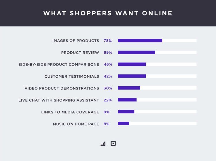
The first thing shoppers want when they visit your website is to see the product images. It is your job to give them what they want and do it quickly. When you are able to do that, people will explore more products, click on them, and often buy.
But showing images is not enough. We have to balance image quality and website loading speed. Here are three simple techniques to show crips & fast loading product images.
- Optimize for high pixel density displays - On a device with DPR (device pixel ratio) 2, a 2x wide image with quality 50 will look better than a 1x wide image with quality 90. Despite being similar in terms of file-size, the DPR-optimized image will look crisp. That is what you want for your e-commerce.
- Resize & optimize from high-resolution originals - Magento, WordPress, Shopify — all of them don't provide the needed image compression controls that are essential for an e-commerce website. The compression is often very aggressive and results in low-quality product images on the website. It would be best if you always resize & optimize images using the original high-resolution version using an image CDN or an open-source tool like Thumbor.
- Use optimal image format - Serve images in the optimal format instead of the same format that you get from graphic designers. The optimal format will depend upon image content and browser format support. You should leverage this to your advantage and serve the best possible image.
Let's understand them one by one with a few examples.
1. Optimize for high pixel density displays
Most of the mobile devices and high-end desktops have a high pixel density display. That means more pixels per inch. So these devices require high-resolution images to fill in those extra pixels.
Considering you get a significant volume of users surfing your store using these devices, you must optimize images to ensure all products look at their best.
On a device with DPR (device pixel ratio) 2, a 2x wide image with quality 50 will look better than a 1x wide image with quality 90.
For example, consider an original image. This is 640px wide.
https://ik.imgkit.net/ikmedia/women-dress-2.jpgLet's get different variants by changing width, dpr, and quality. We will be using ImageKit URL-based image manipulation parameters to achieve this.
High-quality image with no DPR optimization
The 300px wide variant with quality 90 will be:
https://ik.imgkit.net/ikmedia/women-dress-2.jpg?tr=w-300,q-90Low-quality image with DPR optimization
The 300px wide variant with dpr-2 and quality 50 will be:
https://ik.imgkit.net/ikmedia/women-dress-2.jpg?tr=w-300,dpr-2,q-50Now let's compare the two images based on your device's actual dpr value. If your current DPR value is above 1, the image on the right should look crisp.
Despite being similar in terms of file-size, the image on the right is looking crisp. That is what you want for your e-commerce.
Solution
These two techniques are commonly used when implementing responsive images:
-
Using srcset (recommended)
It is straightforward to serve different variants using responsive images dynamically. For example, we can provide multiple variants in srcset attributes and let the browser pick the most appropriate based on the actual device. You will have to change image URLs in the application for this to work. -
Using client-hints
You can also use client-hints which provides an automatic way to implement responsive images. In this case, the browser will send the following headers with every image request:- Width
- DPR
ImageKit will decide the final width of the image based on these headers. You don't have to change the image URL in the application for this to work.
Resources for further reading
Get free consultation for your store
2. Resize & optimize from high-resolution originals
In case your store is built using WordPress or Magento, there is a great chance that your images lose quality after uploading.
There are tons of discussions in the Magento community on this topic. The same is true for WordPress and Shopify. It is tricky to get the right balance between image quality and file size.
Solution
The solution is to use an image CDN. For example, ImageKit.io lets you control quality, height, width & image format using URL friendly query parameters. This means you can easily control the compression settings and get the desired results in terms of image file size and visual quality.
For example, compare these two images. The one on the left is using the Magento platform' resizing, and the one on the right is using ImageKit.io's resizing. The image on the right looks crips.
Resizing images directly from the original image using ImageKit.
In Magento, the original product image is accessible over the URL, as shown below.
https://optimizedstore.imagekit.tech/pub/media/catalog/product/w/j/wj12-blue_main_1.jpgBased on your website layout, let's say we need a 240px wide image for the product listing page. This can be done by adding a query param tr=w-240 in the image URL. You will need to edit the theme files to change these product images URLs.
https://optimizedstore.imagekit.tech/pub/media/catalog/product/w/j/wj12-blue_main_1.jpg?tr=w-2403. Use optimal image format
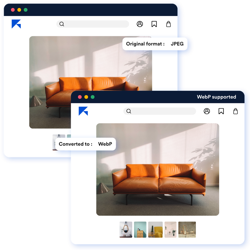
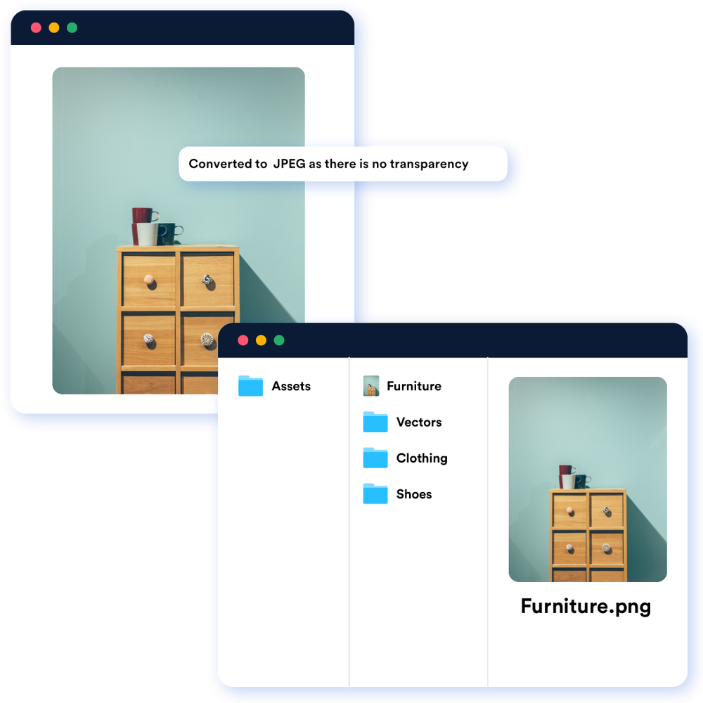
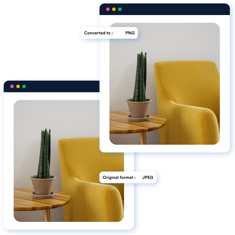
The right format for a particular image can vary based on image content and user device. It could be JPG, WebP, or surprisingly PNG in few cases. A common mistake is to upload and deliver images in the same format that we get from graphic designers.
To avoid this, ImageKit.io lets you use the same image URL in the application but automatically serve different image formats to different users. Here is how image optimization works in ImageKit.io:
Schedule a call with a media expert
Learn more from case studies
How different organizations utilize ImageKit to optimize and transform images to deliver a great user experience